| Author | Thread |
Comments Made During the Challenge  |
|
|
07/20/2004 10:32:38 PM |
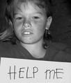
| Good idea. The lighting doesn't help, though. Your lettering is hard to see in that angle, and the photo is pretty dark overall. Perhaps a lighter image reflected behind the letters would have let them show through more. Also, the partial brand name and the door frame are somewhat distracting. |
|
 Photographer found comment helpful. Photographer found comment helpful. |
|
|
07/20/2004 05:19:57 AM |
| Its a great idea, but because it has been done elseware I think that will hurt your score. |
|
| Photographer found comment helpful. |
|
|
07/16/2004 03:01:37 PM |
| I like it, but it's a little grainy. |
|
| Photographer found comment helpful. |
|
|
07/14/2004 09:02:00 PM |
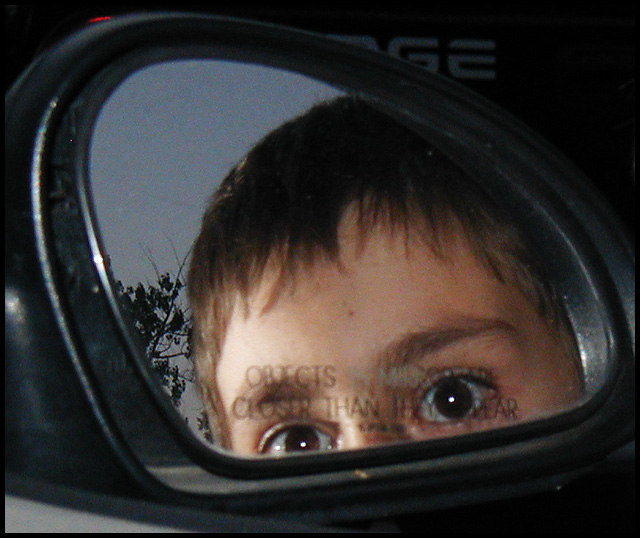
| Not very original. The focus is a little soft. The extreme pinpoint highlights in his eyes have a creepy effect. This isn't a great use of the surrounding areas of the frame. |
|
| Photographer found comment helpful. |
|
|
07/14/2004 08:09:08 AM |
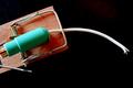
| the flash reflection on the plastic part of the mirror distracts. that could be handled by cropping. also, try experiment with diffent settings for DOF. |
|
| Photographer found comment helpful. |
|
|
07/14/2004 12:48:46 AM |
| the text is a bit too blurry for a punchy shot. cool idea though. |
|
| Photographer found comment helpful. |
|
|
07/14/2004 12:32:50 AM |
| I feel you should have edited this picture as so to see the words better. Good try though. |
|
| Photographer found comment helpful. |
Home -
Challenges -
Community -
League -
Photos -
Cameras -
Lenses -
Learn -
Help -
Terms of Use -
Privacy -
Top ^
DPChallenge, and website content and design, Copyright © 2001-2025 Challenging Technologies, LLC.
All digital photo copyrights belong to the photographers and may not be used without permission.
Current Server Time: 03/12/2025 02:43:03 PM EDT.