| Author | Thread |
Comments Made During the Challenge  |
|
|
08/07/2010 01:26:22 PM |
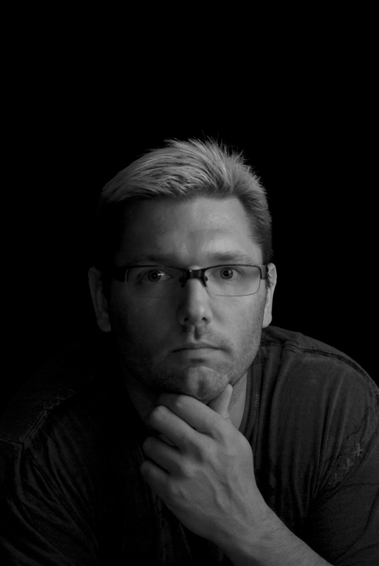
| Simple and direct. I like that it's soft and that the contrast isn't cranked. Makes it more personal. |
|
|
|
08/06/2010 07:11:51 AM |
| Tones a bit to flat in this B&W. Very soft image. Im no pro in portrait but this is what bothers me a bit on this. Not sure where the focus lies and then you have the big empty black space at top. Would like to see what the pro's think of this and I could learn from it. |
|
 Photographer found comment helpful. Photographer found comment helpful. |
|
|
08/03/2010 11:57:56 PM |
| Nice clean and balanced portrait. I do find myself wishing it were a bit brighter. |
|
| Photographer found comment helpful. |
|
|
08/03/2010 11:29:34 PM |
| Lighting is pretty good, composition.....a bit too much negative space at the top for my liking.....but what hurts this the most is really the lack of sharpness (especially in the eye area). - 5 |
|
| Photographer found comment helpful. |
|
|
08/03/2010 07:57:49 PM |
| Good portrait. I think there is a little bit too much space up at the top. |
|
| Photographer found comment helpful. |
|
|
08/03/2010 10:24:36 AM |
| good choice, I like this photo, is really hard to get a good position in a free study, I wish you good luck. |
|
|
|
08/01/2010 09:15:36 PM |
| Nice lighting, but I don't think it has enough "oomph" to do well in a FS. Too much dead space up top for me. 5 |
|
|
|
08/01/2010 05:14:46 PM |
| This is a good overall photo, but if I may I am going to critique you. There is a lot of open space above your head. Also, on my monitor, it appears a bit dark. |
|
| Photographer found comment helpful. |
Home -
Challenges -
Community -
League -
Photos -
Cameras -
Lenses -
Learn -
Help -
Terms of Use -
Privacy -
Top ^
DPChallenge, and website content and design, Copyright © 2001-2025 Challenging Technologies, LLC.
All digital photo copyrights belong to the photographers and may not be used without permission.
Current Server Time: 03/10/2025 09:40:53 PM EDT.