| Author | Thread |
Comments Made During the Challenge  |
|
|
07/20/2004 10:53:37 PM |
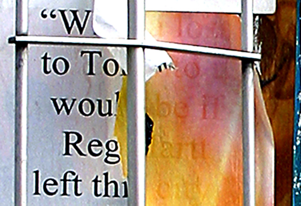
| Looks like an intriguing subject, but the artifacts from sharpening are too distracting (the heavy lines and halos around the letters) |
|
 Photographer found comment helpful. Photographer found comment helpful. |
|
|
07/20/2004 11:54:34 AM |
| how did you do this effect |
|
|
|
07/18/2004 06:17:32 AM |
| A very grainy photo, neat image might have helped this. |
|
| Photographer found comment helpful. |
|
|
07/16/2004 03:33:07 PM |
| I'm not sure what's going on here. From the title I guess it's a sign tha's torn. Maybe if it wasn't cropped so close. |
|
|
|
07/16/2004 02:59:47 PM |
| it looks like it has too much sharpening |
|
| Photographer found comment helpful. |
|
|
07/14/2004 02:32:04 PM |
| I can't tell what is going on with this picture. The image resolution is too low. Even though there are words in the photo, I'm not sure how they relate to the challenge. |
|
|
|
07/14/2004 01:43:01 PM |
| This looks blurry (perhaps a crop from a larger image?), and a little "blown out" at the top. Good concept though. Perhaps cropping the right hand blue material would have balanced this out a bit more. |
|
| Photographer found comment helpful. |
|
|
07/14/2004 01:39:27 PM |
| something looks funny with the letters. it almost looks like a picture of a TV |
|
|
|
07/14/2004 11:01:38 AM |
| Poor image quality, and I don't really get it.. |
|
|
|
07/14/2004 12:32:27 AM |
|
| Photographer found comment helpful. |
Home -
Challenges -
Community -
League -
Photos -
Cameras -
Lenses -
Learn -
Help -
Terms of Use -
Privacy -
Top ^
DPChallenge, and website content and design, Copyright © 2001-2025 Challenging Technologies, LLC.
All digital photo copyrights belong to the photographers and may not be used without permission.
Current Server Time: 03/12/2025 07:34:36 AM EDT.