| Author | Thread |
Comments Made During the Challenge  |
|
|
07/20/2004 11:48:43 PM |
| A very good idea, but I would have worked on it until I got more shatpness. |
|
 Photographer found comment helpful. Photographer found comment helpful. |
|
|
07/16/2004 04:10:36 PM |
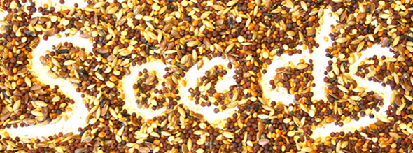
| I like your idea here, the image is sharp and appealing, my only complaint is that the white is too bright, it hurts my eyes, and makes it hard to read. Tone down the white a bit and this will be a nice image. |
|
| Photographer found comment helpful. |
|
|
07/16/2004 03:52:00 PM |
| Clever idea - original. May be slightly over exposed but I actually like the effect. |
|
| Photographer found comment helpful. |
|
|
07/15/2004 11:00:34 AM |
| A petty it's too bright. A nice concept though. It could be better if the light was a bit soft and didn't burn the coulors. |
|
| Photographer found comment helpful. |
|
|
07/14/2004 11:50:30 PM |
|
| Photographer found comment helpful. |
|
|
07/14/2004 09:15:17 PM |
| most original- nicely done! |
|
| Photographer found comment helpful. |
|
|
07/14/2004 09:10:39 PM |
|
| Photographer found comment helpful. |
|
|
07/14/2004 01:15:28 AM |
| Clever idea. I think the first S is cut too short on the left side. It runs off the photo which leads my eyes off the photo too. Good luck :) |
|
| Photographer found comment helpful. |
Home -
Challenges -
Community -
League -
Photos -
Cameras -
Lenses -
Learn -
Help -
Terms of Use -
Privacy -
Top ^
DPChallenge, and website content and design, Copyright © 2001-2025 Challenging Technologies, LLC.
All digital photo copyrights belong to the photographers and may not be used without permission.
Current Server Time: 03/12/2025 01:54:59 AM EDT.