| Author | Thread |
|
|
03/16/2005 03:38:44 PM |
| Wow..your town is so out of this world. I love small towns. |
|
 Photographer found comment helpful. Photographer found comment helpful. |
Comments Made During the Challenge  |
|
|
07/16/2004 08:20:21 PM |
|
| Photographer found comment helpful. |
|
|
07/15/2004 11:39:21 PM |
Nice composition & use of colors.
Good eye! |
|
| Photographer found comment helpful. |
|
|
07/13/2004 02:56:24 PM |
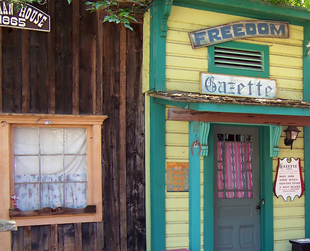
| Good find - nice colors and exposure. It would work far better without the chopped-off sign on the left building. I'sd suggest it sould have been a vertical composition. |
|
| Photographer found comment helpful. |
|
|
07/12/2004 05:22:37 PM |
|
| Photographer found comment helpful. |
|
|
07/12/2004 12:45:12 AM |
| Interesting combination of colors... nice antique feel... The composition feels a bit odd with no 'grounding'... having the door cut off at the bottom without a base just creates a bit of visual discomfort for me. I think a straight-on composition of the front of the yellow/green building would be strong by itself.. including the 'grounding' i mentioned before. Excellent idea for this challenge :) |
|
| Photographer found comment helpful. |
Home -
Challenges -
Community -
League -
Photos -
Cameras -
Lenses -
Learn -
Help -
Terms of Use -
Privacy -
Top ^
DPChallenge, and website content and design, Copyright © 2001-2025 Challenging Technologies, LLC.
All digital photo copyrights belong to the photographers and may not be used without permission.
Current Server Time: 03/14/2025 04:59:31 PM EDT.