| Author | Thread |
|
|
12/15/2002 12:09:52 PM |
Hello Douglas, don't wonder why you get another critique. Your your photo was assigned to me in context of the Critique Club. So here it goes:
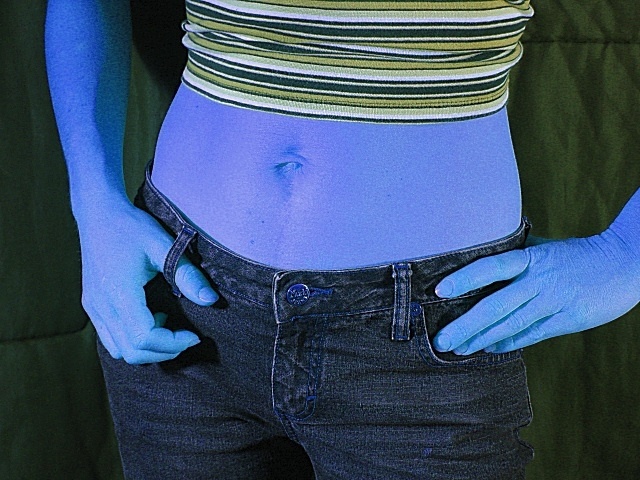
Composition: I agree with John, that a portrait orientation would look better. I would have cropped out the left arm (left as seen from the viewer). It looks a bit strange because you can see the arm belonging to the left hand but then the right hand looks like it is "glued" to her hip. I think you should either show both arms or none.
I also agree that the background is distracting. Maybe if you tried to let your wife stand a bit further away from the background, that would have helped.
Lighting/Colours: You didn't tell it in your photo details but some other people said in their comments that you used black light. I'm not sure about that because when I adjust the hue in my photo editing program by about +160 it looks pretty normal to me (normal skin colour, black jeans, blue shirt). But I never used black light and maybe that is the effect of that type of lighting.
Anyway, while I like the effect in in general, the blue is a bit too much blue for my taste. It looks too unnatural and like you played too much with your image editor. I would like it better if it would be a more faint colour tone.
The drop shadow of your wife is distracting. I thik the suggestion above, to let your wife stand futher away from the backgound, would have helped with that, too.
Focus: As far as I can see everything of your wife is in focus. That's good.
Art: I got the wordplay "blue genes"/"blue jeans" a bit late ;-) I guess that's because the jeans seem to be play a totally unimportant role in this photo. The effect of the blue skin dominates.
Anyway, it's a creative effect and I really like the concept. Also you fulfilled the challenge perfectly but personally I would have liked a less smurf coloured version ;-).
I have a different version (different crop, colour hue and saturation) of your photo. I can send it to you if you want.
Stephan |
|
 Photographer found comment helpful. Photographer found comment helpful. |
|
|
12/11/2002 07:00:05 PM |
Greetings from the Critique Club :)
Doug,
I have read through the comments you received here. I agree with a large part of it. Especially the comment about the skin color clashing harshly with the color of the shirt. If *I* was doing this particular shot, I would have attempted two compositional changes... 1) I would have washed out the background completely. It's not adding any impact to the photo and could be considered distracting. 2) I would have shot from a portrait orientation rather than landscape to fully frame the midsection of your model.
I'm not sure how to quantify the comments you have received on grain... I have the 707 and I haven't had much problem with grain, especially at ISO 100 and short shutter speeds. I think this particular shot (done at 1/40") could have been slightly improved with the saturation at a slightly slower shutter speed... maybe 1/30". I have never tried photographing in black light before and I'm not sure how the camera registers that so I can't really comment intelligently on it...
Also, for the purpose of the Critique Club critiques, I would have included the detail about how you did this shot. If it's a black light, I would have mentioned that in your description :)
Now... knowing how *I* am, let me tell you what I would have attempted here... I think you could have made a quite powerful 'nude' out of this by turning your model around and photographing her back side with her hands clasped in some way behind her back... the black light effect could have been quite interesting in that mode... You could have removed the clothing that is creating the color clash that has already been mentioned. Your wife has a nice figure, but I'm not sure how open she is to doing that type of photography with you.
Keep up the good work :)
John Setzler
|
|
| Photographer found comment helpful. |
Comments Made During the Challenge  |
|
|
12/04/2002 12:21:00 AM |
it's an alien chick... cool... I wonder if the old saying about pink rings true! hehe
~anachronite |
|
|
|
12/02/2002 11:02:00 PM |
cool funky and creative!....tell me, what planet does this blue alien come from
|
|
|
|
12/02/2002 07:55:00 PM |
| This looks like an alien being. |
|
|
|
12/02/2002 07:31:00 PM |
| interesting color...how was that done??? did you use a black light??? i would like to know.... jab119 |
|
|
|
12/02/2002 04:15:00 PM |
| YIKES! How did you get this effect. Interesting, but a little scary. I like how the background goes well with her shirt. Reminds me of the Blue Man Group! Check it out :-) Good luck. |
|
| Photographer found comment helpful. |
|
|
12/02/2002 05:09:00 AM |
| Smurfette? I think backing off a little for this pic to show more of the model would've been better. Without a really strong focal point I don't think there is a lot of purpose to shoot this so close. Well taken pic though and pretty good idea. - Inspzil |
|
| Photographer found comment helpful. |
|
|
12/02/2002 04:53:00 AM |
| Great idea for this good title. However, the image looks to artificial |
|
| Photographer found comment helpful. |
|
|
12/02/2002 01:02:00 AM |
| I think that the color of the shirt clashes with the blue color of the skin. If the shirt had been blue or had some blue in it the overall feel or look to the shot would have been more appealing. |
|
| Photographer found comment helpful. |
|
|
12/02/2002 12:43:00 AM |
| Black Light. Why Grainy. I like the picture though. |
|
| Photographer found comment helpful. |
|
|
12/02/2002 12:31:00 AM |
| Excellent concept I love it, though it's a tad grainy... |
|
| Photographer found comment helpful. |
Home -
Challenges -
Community -
League -
Photos -
Cameras -
Lenses -
Learn -
Help -
Terms of Use -
Privacy -
Top ^
DPChallenge, and website content and design, Copyright © 2001-2025 Challenging Technologies, LLC.
All digital photo copyrights belong to the photographers and may not be used without permission.
Current Server Time: 03/12/2025 07:14:30 PM EDT.