| Author | Thread |
|
|
12/09/2002 03:59:03 PM |
Critque Club...
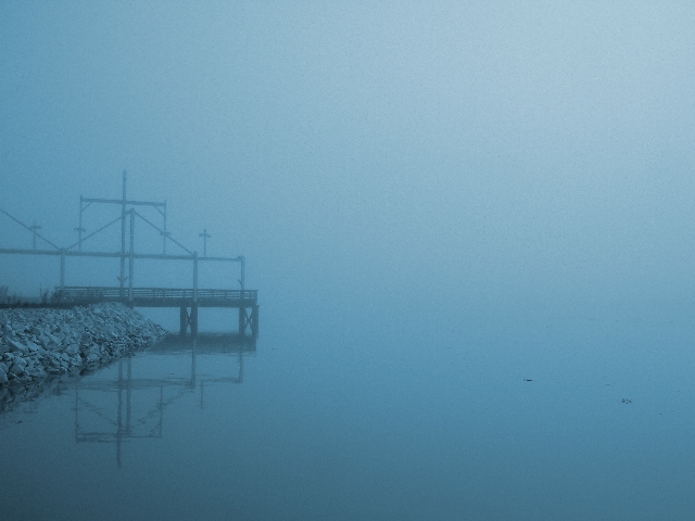
Hi Jak! Before I begin my critique I want you to know that I admire your trying to take a fog photo for the challenge. Fog is very difficult and some people like it and some people don't. It can also be very hard in terms of focus... ok let me get on with the critique.
Composition - This photo includes a little too much blank space for me, although it follows the rule of thirds pretty well, my eyes tend not to go towards the dock. I think had the dock or rocks been moved down just slightly, coming in to the picture at an angle it would have been more effective.
Exposure - interesting... good blues, and with fog I suppose the exposure is good, but it's hard to tell. I like the fact that you can't tell whether its day or night, and I love the eeriness to this photo.
Color - Lots of different blues in here, but tends to be rather drab. I suppose thats what fog does though.
Focus - excellent focusing for doing it through fog! I like how the dock is definitely in focus, but a little soft to give the dreary feeling. Excellent job on that!
Background - The horizon is not visible which is cool, it's a very plain background, not much to say about it.
Fit fo challenge - great, makes you feel blue and cold which it is meant to do. Fits the challenge literally and mentally NICE JOB!
Wowability - although I'm not overly impressed when I immediately look at the photo... when you look more for some of the details it gets more interesting! Still a fairly drab and boring photo, but it comes across well.
Overall nice job, there are somethings you might try differently next time, but like I said, I admire you for entering a fog photo. Good job, and good luck with your next entries!
-Talya
|
|
Comments Made During the Challenge  |
|
|
12/08/2002 11:35:15 PM |
| wow. the horizon disappeared. nice. like the flat colors. 8 |
|
|
|
12/07/2002 02:32:44 PM |
|
|
|
12/06/2002 05:02:42 PM |
| Bit too much space on the right...... |
|
|
|
12/06/2002 12:20:09 PM |
|
|
|
12/06/2002 09:48:24 AM |
Too little of the structure and land included = weak composition.
Nice capture in fog - makes me think of silence. |
|
|
|
12/05/2002 09:31:25 AM |
| I love a good fog shot and this one is excellent. |
|
|
|
12/04/2002 08:56:03 PM |
| One of my favorites this week. BAMartin |
|
|
|
12/03/2002 06:16:00 PM |
| The pier is a bit tilted and the specks in the water are distracting, otherwise a nice mood shot. |
|
|
|
12/03/2002 03:34:00 AM |
| a little more of the thing on the left would improve this picture. the eye wants more and wants to relate to or recognize something more. the crosses look interesting, maybe if the camera was moved a little left, zoomed in a little more, and tilted a little down on the right. |
|
|
|
12/02/2002 09:08:00 PM |
| This is great, however i think that there is too much empty space. |
|
|
|
12/02/2002 06:52:00 PM |
| Cool reflection and pretty blue here. Nice work, maybe this could be a little more sharp. Justine. |
|
|
|
12/02/2002 04:23:00 PM |
| You over emphasized with colorization. Too much empty space on the right. I just don't like the 1/3 rule because too many use it when it doesn't enhance a photo. This rule should be broken a lot of times. Here is one time. Sorry. PTL |
|
|
|
12/02/2002 04:07:00 PM |
| Pretty good, but you should have filled the frame more with the stuff on the left. |
|
|
|
12/02/2002 11:25:00 AM |
| Nice set up. I like the reflection a lot and how the whole rest of the shot is swallowed in the fog. |
|
|
|
12/02/2002 01:27:00 AM |
would be nice if there was a way to show a little detail in the fog...
~anachronite |
|
|
|
12/02/2002 01:09:00 AM |
| Too much empty space, maybe if the crop was further left and inlcuded more of the peer it would have looked better. |
|
|
|
12/02/2002 12:55:00 AM |
| Good shot but it looks a little crooked to me. byetko. |
|