Hello from the Critique Club-
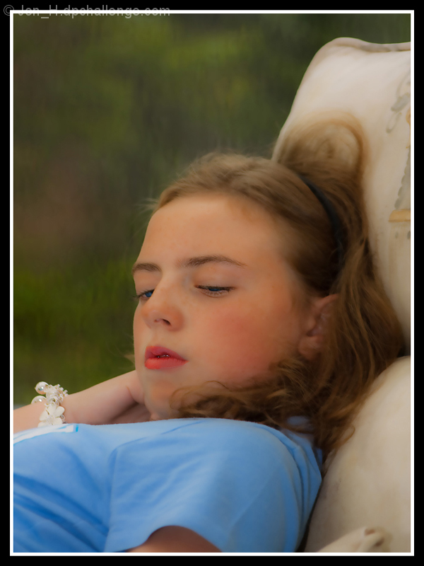
The first thing that strikes me about this is that you have not made the chair a more important element in the photo. Some will vote you down for this, others could care less, but it is something to consider.
As far as technical details go, I think you have done a good job capturing her. I appreciate the softness to the image, and think it matches the mood of the photo/her pose well. Your background has been nicely blurred and is not distracting, keeping our attention focused where it should be. I agree with  EL-ROI that there is too much empty space in the top left. I see her face, and then go back up to the empty area even though there is nothing there. I think I personally may have gone with a little bit more contrast, though that does go contrary to your more dreamy approach, so that would be a personal difference. One thing, though, that I think this would benefit from, is a slightly different pose for your daughter. The mostly closed but partially open mouth is just an awkward middle ground. While I appreciate your use of an off-frame gaze, I�d like to see more of her eyes. Eyes are very important in photographs, and they help us connect as viewers. In this case, I think it might have increased our intrigue and curiosity. Overall, a solid portrait, especially when it comes to lighting, which is very even and pleasing. EL-ROI that there is too much empty space in the top left. I see her face, and then go back up to the empty area even though there is nothing there. I think I personally may have gone with a little bit more contrast, though that does go contrary to your more dreamy approach, so that would be a personal difference. One thing, though, that I think this would benefit from, is a slightly different pose for your daughter. The mostly closed but partially open mouth is just an awkward middle ground. While I appreciate your use of an off-frame gaze, I�d like to see more of her eyes. Eyes are very important in photographs, and they help us connect as viewers. In this case, I think it might have increased our intrigue and curiosity. Overall, a solid portrait, especially when it comes to lighting, which is very even and pleasing.
|