| Author | Thread |
|
|
10/21/2010 08:37:49 PM |
| Good use of neg space, and well found lines. The title fits too. |
|
 Photographer found comment helpful. Photographer found comment helpful. |
|
|
10/20/2010 05:59:00 AM |
Originally posted by posthumous:
your black and whites are getting really, really good. better watch it or you'll be accused of elitism. |
: ) |
|
| Photographer found comment helpful. |
|
|
10/11/2010 07:27:25 PM |
| Excellent BW, great lines and atmospheric pull. |
|
| Photographer found comment helpful. |
|
|
10/09/2010 10:26:45 AM |
|
| Photographer found comment helpful. |
|
|
10/08/2010 04:19:52 AM |
| Congrats, my friend! The beauty of this image is the depth of it's emotion. |
|
| Photographer found comment helpful. |
|
|
10/08/2010 12:21:30 AM |
| I was just getting ready to say the same thing Posthumous said with out the elitism.. You are ROCKING B/W's!!! Not bad for a Texas boy!!! (LOL) |
|
| Photographer found comment helpful. |
|
|
10/08/2010 12:08:25 AM |
| your black and whites are getting really, really good. better watch it or you'll be accused of elitism. |
|
| Photographer found comment helpful. |
Comments Made During the Challenge  |
|
|
10/07/2010 09:45:25 PM |
|
| Photographer found comment helpful. |
|
|
10/07/2010 07:28:51 PM |
| Nice capture and perfect title. |
|
| Photographer found comment helpful. |
|
|
10/07/2010 07:09:15 PM |
|
| Photographer found comment helpful. |
|
|
10/07/2010 05:54:51 PM |
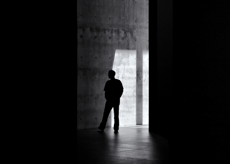
I'm going through the entries, stopping at those images I feel have had the benefit of an unconventional eye and dwelling a little longer to try to see and appreciate what you saw. This is one of those images.
Positives: Super shot with a great title! I really like the composition with the bilateral negative space. I like the way the light catches the glasses too. The stance of your subject and how it mirrors the lighting / shadow is a nice touch.
Critical stuff: Nothing really.
Overall: A very effective image. I like it. |
|
| Photographer found comment helpful. |
|
|
10/07/2010 06:57:31 AM |
| It's an intriguing photo, but I wish he would have been more towards the right than centered. This has a dynamic feel to it, but centering seems to make it more static. I'm not saying it well, but it just doesn't feel right here. -6- |
|
| Photographer found comment helpful. |
|
|
10/05/2010 09:35:45 PM |
|
| Photographer found comment helpful. |
|
|
10/03/2010 04:19:33 AM |
| Title definitely matches to your photo. I like it :) 7 |
|
| Photographer found comment helpful. |
|
|
10/01/2010 11:42:59 PM |
| This image is terrific but your title is FANTASTIC!!!! I keep thinking there is too much negative space on either side, then I think it's a triptych, then I think the visual area is too narrow, then I think this just perfect the way it is. He looks tentative, hesitating before deciding whether to enter the darkness or just walk away. |
|
| Photographer found comment helpful. |
|
|
10/01/2010 08:42:40 PM |
| Nice simple image. Good job on the B&W. |
|
| Photographer found comment helpful. |
|
|
10/01/2010 08:28:03 PM |
| Looks better here than on flickr... |
|
| Photographer found comment helpful. |
|
|
10/01/2010 03:34:53 PM |
|
| Photographer found comment helpful. |
|
|
10/01/2010 01:00:29 PM |
| I found the contrast of this image to be appealing. I like the silhouette style versus what you could of done as a color image. I gave this image a 7. |
|
| Photographer found comment helpful. |
|
|
10/01/2010 04:34:20 AM |
| this is close to top of the heap. don't know how close yet, but it's a very pleasing image. i'll be back. |
|
| Photographer found comment helpful. |
Home -
Challenges -
Community -
League -
Photos -
Cameras -
Lenses -
Learn -
Help -
Terms of Use -
Privacy -
Top ^
DPChallenge, and website content and design, Copyright © 2001-2025 Challenging Technologies, LLC.
All digital photo copyrights belong to the photographers and may not be used without permission.
Current Server Time: 04/25/2025 03:31:15 PM EDT.