| Author | Thread |
|
|
10/08/2010 11:38:27 PM |
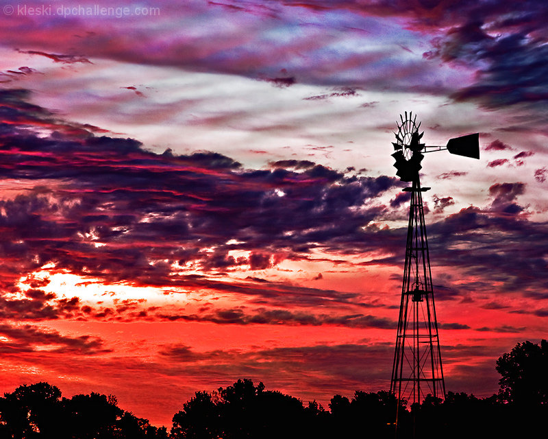
| I didn't even realize there was a windmill in the challenge entry - definitely would have preferred the lesser saturated colors - but even then, I don't feel like the photo would have had the impact you wanted. Silhouette shots are hard like that. |
|
 Photographer found comment helpful. Photographer found comment helpful. |
|
|
10/08/2010 06:34:41 PM |
| I have to agree that the colors are just too over the top. The weather vane is completely consumed by them, whereas in the original there was a nice, sharp subject that stood out against an interesting sky. I think this is one of those times that, though it was there for the taking, less is more. |
|
| Photographer found comment helpful. |
|
|
10/08/2010 09:36:29 AM |
| The colors in the original are so much better! |
|
| Photographer found comment helpful. |
Comments Made During the Challenge  |
|
|
10/07/2010 09:55:47 PM |
| Wow... I think you also hued up too much? 4 |
|
|
|
10/06/2010 02:06:24 PM |
| Wonderful sky. I like the colors of the clouds. 9 |
|
| Photographer found comment helpful. |
|
|
10/03/2010 03:43:29 PM |
| The temptation with a dramatic sky is to overdo it in post-processing. I like the scene, but too much contrast and saturation. |
|
| Photographer found comment helpful. |
|
|
10/01/2010 03:27:34 PM |
| Good choice of silhouette for the focal point but the sky looks overdone, apologies if that is truly what it was like, good luck |
|
| Photographer found comment helpful. |
Home -
Challenges -
Community -
League -
Photos -
Cameras -
Lenses -
Learn -
Help -
Terms of Use -
Privacy -
Top ^
DPChallenge, and website content and design, Copyright © 2001-2025 Challenging Technologies, LLC.
All digital photo copyrights belong to the photographers and may not be used without permission.
Current Server Time: 03/11/2025 02:33:37 PM EDT.