| Author | Thread |
|
|
08/01/2004 10:46:16 PM |
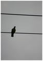
I tend to agree with the comments the photo is just to dark and needs brightened up slightly. Also the title seems to leave you questioning what contrast.
Message edited by HBunch - Removed Critique Club status. |
|
Comments Made During the Challenge  |
|
|
07/25/2004 12:59:11 AM |
For a shot with that title, it's a little low in contrasts...
TC |
|
|
|
07/22/2004 11:36:21 PM |
|
|
|
07/22/2004 07:29:06 AM |
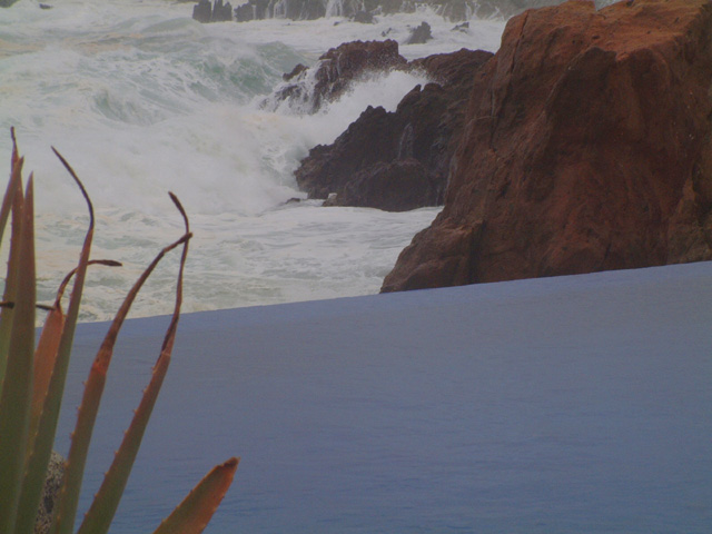
| Interesting image with plenty going on but iam struggling to see balance. |
|
|
|
07/21/2004 02:39:50 AM |
| I like the different layers and elements in this photo. The DOF is great and your composition is nice too. Colors don't seem to be saturated enough though, but that may just be me. Nice work. |
|
|
|
07/20/2004 05:35:37 AM |
| Unfortunately contrast is what this image lacks. Looks like fairly inclement weather which doesn't help with contrast either. The ledge running across the bottom is really distracting and has no real value compositionally. The Aloe at left is also seemingly out of place and the dead bits detract from it also. |
|
|
|
07/20/2004 03:17:49 AM |
| Contrast? This image is lacking some. |
|
|
|
07/19/2004 08:44:03 PM |
| Strange title, I would say more contrast would be needed to improve the image. Don't see the balance either. |
|
|
|
07/19/2004 05:22:59 PM |
| Nice shot, but this needs to be much brigher. Photoshop would have helped out a lot here. |
|
Home -
Challenges -
Community -
League -
Photos -
Cameras -
Lenses -
Learn -
Help -
Terms of Use -
Privacy -
Top ^
DPChallenge, and website content and design, Copyright © 2001-2025 Challenging Technologies, LLC.
All digital photo copyrights belong to the photographers and may not be used without permission.
Current Server Time: 12/14/2025 02:02:52 PM EST.