| Author | Thread |
|
|
11/14/2010 07:16:42 PM |
|
Comments Made During the Challenge  |
|
|
10/19/2010 06:13:04 PM |
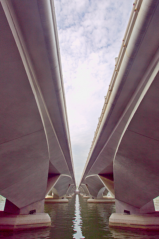
| I like this photo but the post processing makes it look a bit noisy, especially in the dark corners. It's really nice with the line the two bridges make but it would probably look better if it was in the centre at the top as well as at the end of the bridge. |
|
|
|
10/18/2010 05:37:54 PM |
| I like this but I think I would like it better as B&W |
|
|
|
10/16/2010 09:08:59 AM |
| The colors are odd (the pink makes me nauseous)- otherwise I like the subject and the perspective. |
|
|
|
10/13/2010 04:36:45 AM |
| interesting architecture, too bad this is not symmetrical. strong chromatic aberration and color noise |
|
Home -
Challenges -
Community -
League -
Photos -
Cameras -
Lenses -
Learn -
Help -
Terms of Use -
Privacy -
Top ^
DPChallenge, and website content and design, Copyright © 2001-2025 Challenging Technologies, LLC.
All digital photo copyrights belong to the photographers and may not be used without permission.
Current Server Time: 03/11/2025 02:59:46 PM EDT.