DPChallenge: A Digital Photography Contest You are not logged in. (log in or register
 
Challenge Entries
Portfolio Images
This image is not part of a public portfolio.
Pieces of the Pallet
bergiekat


Photograph Information Photographer's Comments
Challenge: Chalk (Advanced Editing VII)
Camera: Canon EOS-40D
Lens: Canon EF 100mm f/2.8 USM Macro
Location: Kitchen
Date: Oct 17, 2010
Aperture: 5.6
ISO: 400
Shutter: 1/20
Galleries: Abstract, Textures
Date Uploaded: Oct 17, 2010

Pretty much straight from the camera. Broken pieces of the fat sidewalk chalk.

Statistics
Place: 43 out of 55
Avg (all users): 5.2532
Avg (commenters): 6.5000
Avg (participants): 4.8710
Avg (non-participants): 5.3465
Views since voting: 823
Views during voting: 345
Votes: 158
Comments: 6
Favorites: 0


Please log in or register to add your comments!

AuthorThread
10/28/2010 08:01:38 AM
Hi again Kat - welcome back to the Critique Space!

My intial take is that I really like the colours, texture and structure of this shot (I disagree with the composition and focus comments below, personally), but that it doesn't pop as much as it could or should.

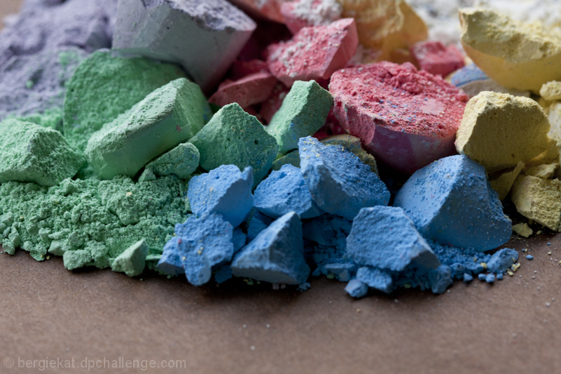
Technically: The DOF is slightly unspecific - by which I mean that more or less all of the chalk is 'sort of' in. Perhaps either a more inclusive, or smaller DOF would have been more interesting? I would tend to a longer DOF to make the most of the contrasts and textures. Bumping the sharpness a little in PS would also help here. This also needs more light to give it 'pizazz'! I don't have an off camera flash at the moment, but for indoor shots, using a business card at an angle to bounce my on camera flash off the ceiling works rather well - clearly from those settings, light was an issue and I suspect the single biggest reason for not getting a higher score.

Artistically: As I said, I think that the composition is just fine, as is the point of focus. My eye is immediately drawn to the red, not the blue so I think it is right to focus on that. The crumbs at the front are a little distracting - if it is not possible to clean them away, I'm sure that they could be legally PS'd out... ;o)

In summary, for me it is really just the light that lets this down - with a side issue that I think increased DOF would help get the best out of the textures, but it is still a really nice shot, which I would not have thought to take, so kudos for that!

Frank.
  Photographer found comment helpful.
 Comments Made During the Challenge
10/24/2010 09:16:51 AM
I would have bumped this up (mind you I didn't give you a bad score at all) if the blue chalk in the front was the strongest point of focus...fading back and beyond...I really like your composition and all the varying colors and textures...really well done
  Photographer found comment helpful.
10/22/2010 01:21:18 PM
Wow vivid colors
  Photographer found comment helpful.
10/20/2010 11:36:52 PM
A bit out of focus
10/19/2010 10:32:36 PM
Nice naturally vibrant colors here! For my taste, I would be curious to see it without the foreground (table?)....I find the texture of the crumbled chalk to be more interesting.
  Photographer found comment helpful.
10/19/2010 12:28:57 PM
Really like the textures and colors. The empty surface at the bottom of the image could probably be cropped away by half or so for a stronger image. 8 nevertheless.
  Photographer found comment helpful.


Home - Challenges - Community - League - Photos - Cameras - Lenses - Learn - Help - Terms of Use - Privacy - Top ^
DPChallenge, and website content and design, Copyright © 2001-2025 Challenging Technologies, LLC.
All digital photo copyrights belong to the photographers and may not be used without permission.
Current Server Time: 03/14/2025 11:24:39 PM EDT.