| Author | Thread |
Comments Made During the Challenge  |
|
|
07/22/2004 07:44:17 AM |
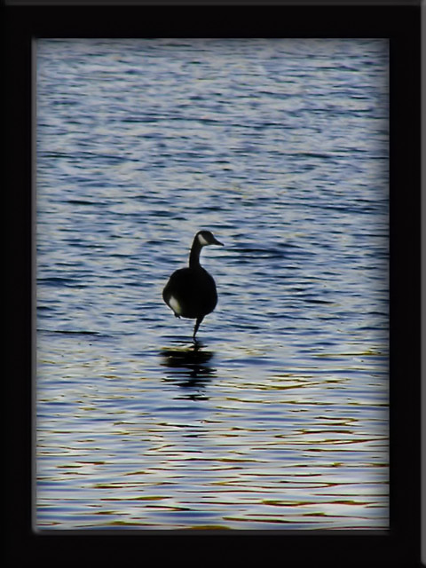
| Great shot. Its simplicity speaks for itself. I think the border is too heavy and detracts from the image. The depth of field is effective. I think the central composition doesn't make the most of the subject. Cropping it offset to one side or something similar may have created just a bit more interest. Great shot though. |
|
 Photographer found comment helpful. Photographer found comment helpful. |
|
|
07/21/2004 10:44:16 PM |
| Good idea and image but i feel the border is a bit large and detracts from the picture. |
|
| Photographer found comment helpful. |
|
|
07/21/2004 02:20:20 AM |
| Great photo. The low light and reflection of the bird really look nice. I'm not craxy about the border though as it is really robust and almost gives the photo a crammed feel. |
|
| Photographer found comment helpful. |
|
|
07/20/2004 03:29:59 AM |
| I like the photo, but not the frame, as I find that has overwhelmed the actual image. |
|
| Photographer found comment helpful. |
|
|
07/19/2004 08:48:26 PM |
| Interesting picture not sure I like the frame. |
|
| Photographer found comment helpful. |
|
|
07/19/2004 07:31:24 PM |
| I wonder how they do that! Nice goose. I like the gold in the foreground. Not crazy about the heavy border and I think a closer shot of the bird might have been more effective. |
|
| Photographer found comment helpful. |
|
|
07/19/2004 05:35:58 PM |
| Not sharp enough and could use some color adjustment. 7 |
|
| Photographer found comment helpful. |
|
|
07/19/2004 01:22:37 PM |
|
| Photographer found comment helpful. |
|
|
07/19/2004 12:20:16 PM |
| The frame is really overpowering this photo. A small simple border (or none at all) would have been much better. The photo meets the challenge well...could have been a tad more focused. The colors and lighting are very nice. |
|
| Photographer found comment helpful. |
|
|
07/19/2004 08:21:33 AM |
| This is nice, seems a little soft on focus though, I always like water better taken at longer exposure or if its not windy outside, But I guess the bird would have moved if you had taken this on a long exposure, Good luck |
|
| Photographer found comment helpful. |
|
|
07/19/2004 05:22:19 AM |
| Great capture. Two things that I would re-consider are the choice of frame and the positioning of the subject. The frame seems to be over-powering, too big and chunky and the subject could possibly be located down the bottom left third. I don't think that the resulting negative space in the upper right would detract from the image. Overall very nice image though, well done (7) |
|
| Photographer found comment helpful. |
|
|
07/19/2004 01:08:28 AM |
waaaaaaaaaaaay toooooooooo muchhhhhhhhhhhhh frrrrrrrrrrrrrrrrrrame....
picture a8 - frame = a5 |
|
| Photographer found comment helpful. |
Home -
Challenges -
Community -
League -
Photos -
Cameras -
Lenses -
Learn -
Help -
Terms of Use -
Privacy -
Top ^
DPChallenge, and website content and design, Copyright © 2001-2025 Challenging Technologies, LLC.
All digital photo copyrights belong to the photographers and may not be used without permission.
Current Server Time: 03/12/2025 08:02:44 PM EDT.