| Author | Thread |
|
|
07/31/2004 05:15:40 PM |
From the critique club:
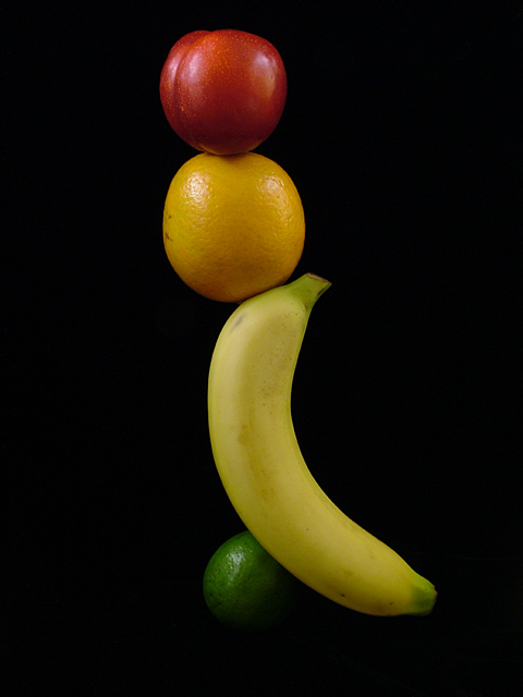
A very interesting vertical composition. At first glance it illicits a very up feeling. Its object being more to entertain and please the eyes. The dark background, whether used to hold the composition, makes the colors reach out and give it that almost pop art feel. This picture simply makes the viewer smile. Disguised behind the expert lighting and above average composition is a healthy sense of humor which comes right true on first glance.
In real life, the structure would fall, but your object here was not to actually balance the fruits but to hint at the thought. Yet, it is this approach which gives it that odd comical look. You take care, minus the typo, to infer the nutritional balance and you have succeeded.
Since the composition is strong and the lighting is superb, there is nothing that I can add here. In particular you did a superb job with the lightinhg. The highlights preserve the texture and the fading into dark at the bottom gives it that artistic touch. Above all, you have made the fruit and the colors very true. This is a worthy addition to any port. In short, it is beyond my criticism. dan
Message edited by author 2004-07-31 17:17:55. |
|
Comments Made During the Challenge  |
|
|
07/25/2004 02:13:18 PM |
| tall vertical crop would really focus on the balance |
|
 Photographer found comment helpful. Photographer found comment helpful. |
|
|
07/25/2004 01:34:01 AM |
| good lighting and color. I like the composition as well. |
|
| Photographer found comment helpful. |
|
|
07/23/2004 12:45:10 AM |
| This composition has a jovial feel. The colors are very rich and true and the focus is on the money. |
|
| Photographer found comment helpful. |
|
|
07/22/2004 05:58:46 AM |
| I really like this it shows balance has good lighting and intrigue. |
|
| Photographer found comment helpful. |
|
|
07/21/2004 04:09:02 PM |
Nutrional Balance?? (I think you missed some letters). Well, I am not going to score you low for a typo. To me even if the title says -*/)9*7^5$$$, It's the image that I am intererested in. Your idea is good and you have done a good bit of work on it. But it doesn't really grab my attention. I am not writing this because I am going to give you a really low score.
You have actually done something instead of finding the easy way out. But, to me the image doesn't really show Nutritional Balance. It's more like fruits balancing. I think when you come up with titles like that (without the typos) it has to convey a message. And I don't think this image does. Best of luck and I do hope that you will keep on pushing. |
|
| Photographer found comment helpful. |
|
|
07/20/2004 06:57:28 PM |
| I don't like that the top of the banana is cut off, looks unnaturual. Perfect setup, nice lighting/background. Lovely idea, should do well. |
|
| Photographer found comment helpful. |
|
|
07/20/2004 05:17:49 AM |
| Love the lighting and composition. The black background sets off the subject(s) very nicely. Well done (9) |
|
| Photographer found comment helpful. |
|
|
07/19/2004 01:32:40 PM |
|
| Photographer found comment helpful. |
Home -
Challenges -
Community -
League -
Photos -
Cameras -
Lenses -
Learn -
Help -
Terms of Use -
Privacy -
Top ^
DPChallenge, and website content and design, Copyright © 2001-2025 Challenging Technologies, LLC.
All digital photo copyrights belong to the photographers and may not be used without permission.
Current Server Time: 03/12/2025 06:45:58 PM EDT.