| Author | Thread |
|
|
08/02/2004 09:27:49 AM |
From the critique club:
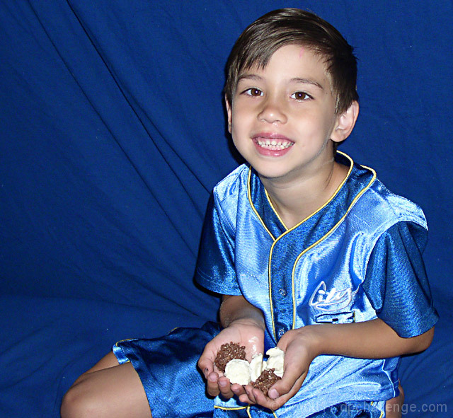
This is a cute picture with more a personal feel. It is well composed in so far as the general position. However, it is not the best for the challenge because the chocolate does not have a prominent role. It is acceptable to downplay the chocolate if the rest of the comp makes up for it.
Like I said this is a likable picture and one that the family and friends would be happy to look and enjoy. What follows is merely a suggestion on how to add a little more interest and make it more of a contender.
You opted for a studio-like background and this is okay, however, I would have decreased the dof to blur the backdrop a bit. Second, The shinny top creates an immediate problem because it will hog most of the light. So the general rule is: use bounced light for shinny objects instead of direct.
Next: the chocolate. If you want to keep the identical cropping than have the cute boy look at the chocolate instead of into the camera. Now, to add even more interest, I would have stayed with just brown chocolate and smeared a fair amount around his mouth. Of course, a tighter crop would have added more interest because it would bring the chocolate closer to the viewer.
I know just how these things happen. You state your idea and your models gets dressed and then you play with the viewfinder and somehow you decide to include more and more into the picture. After all, the outfit is so attractive, why not include more of it. Well, this is the temptation the photographer faces. There is always the natural impulse to include more at the cost of the main interest of the composition.
To conclude: Like I said, these are merely suggestions. The picture has enough value to stand as is. You seem to have the talent to pull a composition together. You just need to keep more focus on the subject in order to exploit its meaning. |
|
 Photographer found comment helpful. Photographer found comment helpful. |
Comments Made During the Challenge  |
|
|
07/27/2004 08:13:52 PM |
| good idea, but the candy is hard to find amongst all the blue |
|
| Photographer found comment helpful. |
|
|
07/27/2004 08:09:26 PM |
| It would maybe help if there wasn't the wrinkles but everything can't be perfect is what I say but very nice. 8 |
|
| Photographer found comment helpful. |
|
|
07/27/2004 07:51:13 AM |
| I think the chocolate needs to be more part of the image. |
|
| Photographer found comment helpful. |
|
|
07/27/2004 06:53:51 AM |
| Nice composition & great model but the harsh burst from the (camera mounted?) flash makes the image seem a bit too much like a snapshot. I suggest using several light sources with a competetive brightness to your flash next time, or no flash at all. |
|
| Photographer found comment helpful. |
|
|
07/25/2004 11:08:57 PM |
| nice photo of a cute boy, but the main subject should be chocolate |
|
| Photographer found comment helpful. |
|
|
07/25/2004 03:53:41 AM |
| this is cute, looks too sharp though? |
|
| Photographer found comment helpful. |
|
|
07/23/2004 03:05:08 PM |
The main problem is that the lighting is too direct and harsh, as if from a camera hotshoe-mounted flash. Using off-camera light sources off to the side and using a reflector or diffuser to soften the light would make this picture a hundred times better.
Also, the choice of a blue background and the blue uniform is actually not a good choice. The subject isn't well separated from the background.
The placement of the subject is pretty good, although it might be more interesting if the camera was lower, it's kind of looking down on the boy and might be improved by getting lower. |
|
| Photographer found comment helpful. |
|
|
07/23/2004 12:16:27 PM |
| The emphasis here doesn't seem to be the chocolate, but the boy. It's a nice, clear shot - but the lighting is very harsh. It would be tough to take a shot with that shiny material he's wearing. Very cuite little guy! |
|
| Photographer found comment helpful. |
|
|
07/23/2004 01:39:50 AM |
| My eyes are drawn to the color blue and cute child, not the chocolate. |
|
| Photographer found comment helpful. |
|
|
07/22/2004 11:36:23 PM |
| Nice colors - cute model. Pix seems very staged and static. |
|
| Photographer found comment helpful. |
|
|
07/21/2004 09:39:12 AM |
| focus is too much on the boy |
|
| Photographer found comment helpful. |
|
|
07/21/2004 08:01:05 AM |
| I like the bakdrop and how the creases (diagonal & horizontal) lead the eye back to the subject. The flash is a bit too harsh and casts too defined of a shadow behind the boy. You might want to try bouncing or defusing the flash next time (can be done w/ a peice of paper if you only have the built-in flash). My only other thought is that the blue on blue is a bit detracting. |
|
| Photographer found comment helpful. |
|
|
07/21/2004 05:59:36 AM |
| Nice crop exposure, but had to search for the chocolate |
|
| Photographer found comment helpful. |
|
|
07/21/2004 01:57:44 AM |
| This is a really cute photograph!! Everyone can relate to childhood memories of going to the candy store :) I'm not sure if I like the background, however. I think a background of something child like would suit the photo more. This is very cute, though :) |
|
| Photographer found comment helpful. |
Home -
Challenges -
Community -
League -
Photos -
Cameras -
Lenses -
Learn -
Help -
Terms of Use -
Privacy -
Top ^
DPChallenge, and website content and design, Copyright © 2001-2025 Challenging Technologies, LLC.
All digital photo copyrights belong to the photographers and may not be used without permission.
Current Server Time: 12/14/2025 03:33:02 PM EST.