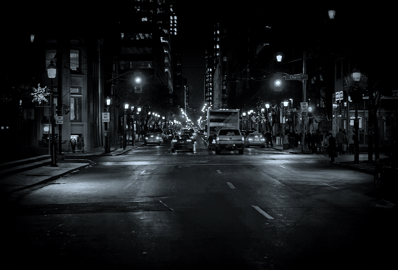
I initially was going to complain that there's too little happening in the foreground and you should be closer. But on second thought, it offers an interesting contrast.
I'm going through the entries, stopping at those images I feel have had the benefit of an unconventional eye and dwelling a little longer to try to see and appreciate what you saw. This is one of those images.
Positives: I like the idea behind this shot - the glowing lights, the bustling scene. I like how you have deviated from straight monochrome too.
Critical stuff: This is the sort of shot I would normally like but there are a few elements that conspire to detract from it's overall feel:
1. We are distant from the scene, although I'm a fan of negative space the emptiness of the lower frame here is not quite empty enough to merely act as a guide for the eye and as a consequence frustrates rather than delights. We remain remote and uninvolved.
2. The overall sharpness - it just doesn't have enough clarity to communicate the scene well; I remember the street signs picture that ribboned a few weeks back, the clarity in that shot was astounding and contributed much. You could do with some of that magic here.
3. Coloration- I appreciate the slight bluish hue but I think you could push it further. Checkout JimiRose's 8+ scoring image of Rome just to see how well blue coloration can work on a might time city street scene.
Overall, this image demonstrates a good eye but (for me) needs a bit more finesse to do well.
This is one of those images that would be easy to speed by, because to be appreciated, it requires the viewer to stop and examine it. My theory is that due to the comparatively large number of entries in the FS, voters tend to speed through and use the thumbnails as a guideline. This thumbnail doesn't show anything at all, except a couple of specks of light. It does not have bright, pretty colors, and it does not have large shapes or harsh contrasts. What it IS is very delicate and nuanced, which sadly does not do well in FS.
I do think the image could be improved a little bit, namely by cropping closer to the scene. For me, the negative space at the bottom and on either side doesn't do much for the image, and in fact, removes us from the bustle of the street. We are too far to appreciate all those lovely details. I might also play around with dodging the lights and other lit bits, or maybe contrast, because for some reason, the image overall is a bit murky. Finally, though it is a lovely street scene, there is no one compelling thing to draw me in. Not a pedestrian crossing, or litter flying, or something that makes this particular scene truly unique, and not enough detail to appreciate it for the detail.