| Author | Thread |
|
|
11/30/2012 10:27:28 PM |
| How can you not smile at this? |
|
 Photographer found comment helpful. Photographer found comment helpful. |
|
|
01/08/2011 12:42:02 AM |
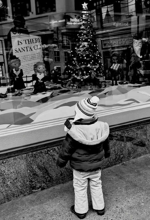
| In my opinion, the tones are rich and the contrast deep - works just fine for me. And makes me smile! :-) |
|
| Photographer found comment helpful. |
|
|
01/08/2011 12:17:41 AM |
Originally posted by smardaz:
the tones seem to be a little flat in this shot |
must be referring to the Macy's building/reflection, I suppose the window display itself could have benefited from some dodging |
|
| Photographer found comment helpful. |
|
|
01/08/2011 12:14:30 AM |
| another candid study of life under appreciated by the average voter, lovely black and white as well |
|
| Photographer found comment helpful. |
Comments Made During the Challenge  |
|
|
01/07/2011 09:31:38 PM |
| Looks kind of like the window display here in downtown Pittsburgh. Nice candid. |
|
| Photographer found comment helpful. |
|
|
01/06/2011 06:59:03 AM |
| the tones seem to be a little flat in this shot |
|
| Photographer found comment helpful. |
|
|
01/04/2011 10:24:47 PM |
| great picture....I can feel how he/she is just pulled into the display in the window... |
|
| Photographer found comment helpful. |
|
|
01/03/2011 01:50:15 PM |
| Sharp and tells a story! I love the reflections. |
|
| Photographer found comment helpful. |
|
|
01/03/2011 09:04:44 AM |
I'm going through the entries, stopping at those images I feel have had the benefit of an unconventional eye and dwelling a little longer to try to see and appreciate what you saw. This is one of those images.
Positives: OK, this is lovely, a very cute image with great story. There are a number of stand-out elements in the image - the Macy's sign, the newspaper, the reflected figure above it, the tree with its star...
Critical stuff: I've probably underscored it a little at a six but I am between a 6 and a 7. Reasons for not bumping to a 7:
For me, it lacks a little punch - I think this is down to the contrast profile, i wonder if brighter whites (shifted levels) would help. I'm a fan of grain and I'd add some, though I know that isn't everybody's cup of tea.
Those stand out compositional elements mentioned above are, I think, undersold - some curves manipulation or other technique to make these features more prominent might make a real difference.
I suppose what Im saying is that perhaps you have been too subtle with the image - you've concentrated on the child but for me the really interesting elements are in the top half of the image.
Overall: I think this is a great capture with a suboptimal edit (at least for the FS... for Outside looking In your emphasis is perfect) |
|
| Photographer found comment helpful. |
|
|
01/02/2011 09:36:30 PM |
| Nice job capturing the scene. I like how the diagonal lines create a sense of movement. |
|
| Photographer found comment helpful. |
|
|
01/01/2011 10:41:11 PM |
| See, I'm the sort of DPCer that loves this kind of image. It's intimate, and highly personal. There is a lot to see, and it requires analyzing and exploring. All the various elements all converge on the rapt attention of the little child. The tilt adds a bit of a Twilight Zone feel to it, something that may further alienate FS voters who seem to prefer easily accessible, feel good (rather thank think good) images. As I continue to explore the image, the "Is there a Santa Clause" question becomes a prominent element - one which I didn't notice before. And I love that we can see "Macy's" reflected in the window, which is where (I believe) where portions of the movie refer to. |
|
| Photographer found comment helpful. |
Home -
Challenges -
Community -
League -
Photos -
Cameras -
Lenses -
Learn -
Help -
Terms of Use -
Privacy -
Top ^
DPChallenge, and website content and design, Copyright © 2001-2025 Challenging Technologies, LLC.
All digital photo copyrights belong to the photographers and may not be used without permission.
Current Server Time: 03/14/2025 07:49:48 PM EDT.