| Author | Thread |
|
|
01/22/2011 05:31:41 AM |
Greetings from the Critique Club :)
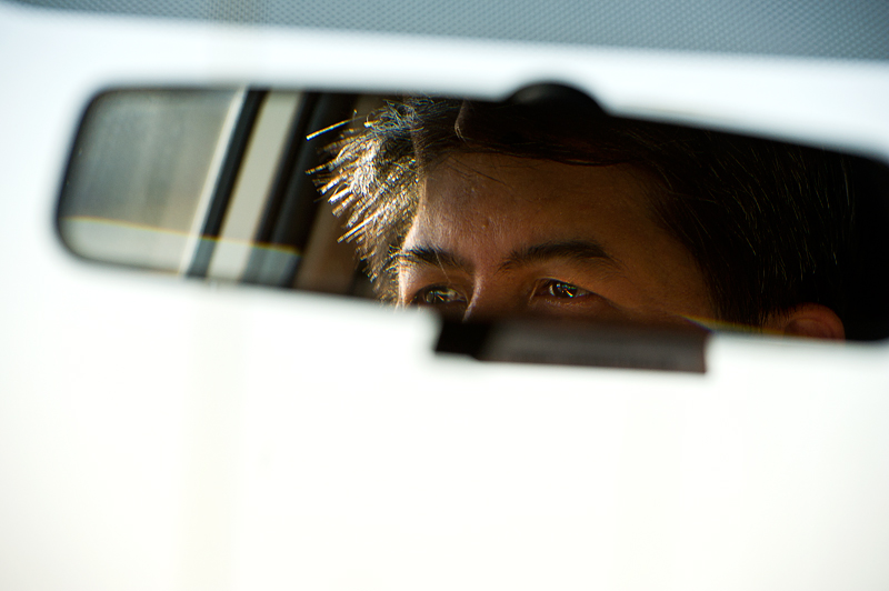
First impression: not very appealing harsh background
By looking at it much longer, I still do not fall in love with your tones. The lighting on the skin and hair looks fine and the colored diffraction pattern in the eyes is a plus. But most of the surface is this imperfect harsh white, with an ugly yellowish vertical streak. The top right blue-grey triangle just destroys the strong contrast, that's certainly no added value.
The mirror gives a nice frame within a frame for the portrait. The eyes are very close to the border, which draws a lot of attention on them and creates a tension in the picture. I guess that is your concept of out of balance. But the mirror itself is placed where you would expect it on a windscreen (they are also always a bit tilted), meaning that the rest of the composition is quite traditional. Therefore I wonder if you did not get some DNMC votes.
Sorry for sounding rather negative. I like a lot some of your photos and the way you think about them.
If you have questions or remarks about this critique, feel free to contact me.
Mike |
|
Comments Made During the Challenge  |
|
|
01/14/2011 03:08:55 AM |
| i generally like these types of shots, could use a more dramatic sky tho |
|
 Photographer found comment helpful. Photographer found comment helpful. |
|
|
01/13/2011 09:02:26 PM |
|
Home -
Challenges -
Community -
League -
Photos -
Cameras -
Lenses -
Learn -
Help -
Terms of Use -
Privacy -
Top ^
DPChallenge, and website content and design, Copyright © 2001-2025 Challenging Technologies, LLC.
All digital photo copyrights belong to the photographers and may not be used without permission.
Current Server Time: 03/15/2025 05:41:27 AM EDT.