| Author | Thread |
Comments Made During the Challenge  |
|
|
08/01/2004 10:43:16 PM |
| Wonderful image, wonderful tones. Great job. |
|
 Photographer found comment helpful. Photographer found comment helpful. |
|
|
08/01/2004 06:50:11 PM |
| I like the shot - works very well with limited color. |
|
| Photographer found comment helpful. |
|
|
07/31/2004 12:25:52 PM |
-
Message edited by author 2005-04-08 23:52:16. |
|
|
|
07/30/2004 05:20:51 PM |
| Great shot. One of my favorites this round. Creative use of the DPC abbreviation as well = ) |
|
|
|
07/30/2004 03:46:59 PM |
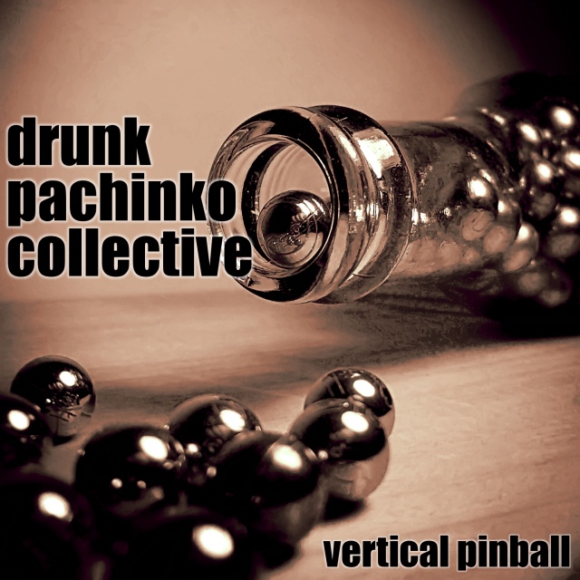
| I think this shot is great...I just wish that the lettering wasn't covering up the lip of the bottle. The distortion just under the bottle is also a little distracting. |
|
| Photographer found comment helpful. |
|
|
07/30/2004 11:50:01 AM |
| I like this. Technically it has some problems, like the highlights and the shadow area below the bottle, but it is a good idea with the visual impact needed to help sell an album. Hope you place well. |
|
| Photographer found comment helpful. |
|
|
07/29/2004 05:53:21 AM |
| Love the lighting and DOF here. 9 |
|
| Photographer found comment helpful. |
|
|
07/28/2004 06:36:16 PM |
| Awesome! I was going to submit one but not enough time on my part, I would have named it, Derelict Porstituted Conglomerate, and had one of those dancing coke cans that dance when you sing. |
|
|
|
07/28/2004 01:45:15 PM |
| Superb image, one of my favourites in this challenge. |
|
|
|
07/27/2004 04:32:50 PM |
Nice to have an album cover which isn`t just a reflection of the groups name but shows a bit of originality by reflecting the name of the album.
Nice work |
|
| Photographer found comment helpful. |
|
|
07/27/2004 12:08:34 PM |
| Excellent creative idea, visually very attractive and love the colours.....but there's an area under the neck of the bottle that appears patchy ?reflection from the glass. Overall though......very striking image. |
|
| Photographer found comment helpful. |
|
|
07/27/2004 07:09:47 AM |
Wow. Good focus. Good use of dof.
Text is very complimentary to the pic.
Very nice overall. |
|
| Photographer found comment helpful. |
|
|
07/27/2004 05:17:25 AM |
| Drunk... pachinko... it goes. It's a beautiful shot, the text is nice, I just hope people get it! |
|
| Photographer found comment helpful. |
|
|
07/26/2004 11:02:22 PM |
| I like this one, verry well executed, sharp and clear, excellent DOF, and I can clearly see it on a real album cover. |
|
| Photographer found comment helpful. |
|
|
07/26/2004 08:57:38 PM |
| Great setup in both the foreground and background. The DOF is really good. Nice tone too. (9) |
|
| Photographer found comment helpful. |
|
|
07/26/2004 07:03:09 PM |
| Good photo. Nicely done text. |
|
|
|
07/26/2004 05:45:23 PM |
| Hey, I've learned a new word! (Had to google pachinko). Really like the image and the choice of lighting and slightly shallow DOF works well. Text design and position is good. 9 |
|
| Photographer found comment helpful. |
|
|
07/26/2004 12:33:15 PM |
| nice job with the lettering. i really like the white outline around the letters. the whole layout is quite nice. |
|
| Photographer found comment helpful. |
|
|
07/26/2004 10:14:28 AM |
|
|
|
07/26/2004 06:48:34 AM |
| Great shot. The Duotone and contrast are perfect, as is the lighting. 10 |
|
| Photographer found comment helpful. |
|
|
07/26/2004 02:35:54 AM |
| superb tone and lighting.. well done |
|
| Photographer found comment helpful. |
|
|
07/26/2004 12:20:03 AM |
| Beautiful treatment of color. Nice focus. |
|
| Photographer found comment helpful. |
Home -
Challenges -
Community -
League -
Photos -
Cameras -
Lenses -
Learn -
Help -
Terms of Use -
Privacy -
Top ^
DPChallenge, and website content and design, Copyright © 2001-2025 Challenging Technologies, LLC.
All digital photo copyrights belong to the photographers and may not be used without permission.
Current Server Time: 03/12/2025 02:04:17 AM EDT.