| Author | Thread |
|
|
08/08/2004 11:21:23 PM |
Hi Robert from the Critique Club
I think looking at your score and your comments that the voters did like this image
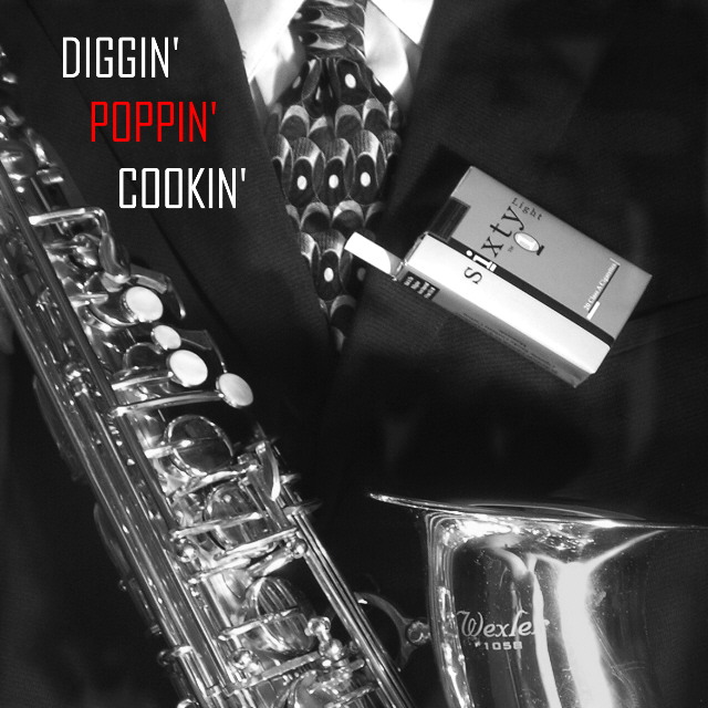
It is very interesting and I agree with the voters about the ciggarettes
I think the image would have been just as good if not better without them
I just love the saxaphone and the suit and tie is great.A nice elegant image nicely presented for a Jazz c d Black and white great
Focus detail and crop are all fine
So I can't really find any thing negative about this image just all positive. Well Done
There were a lot of excellent images in this challenge and you received a very presentable score. I hope you continue to enjoy your photography and good luck in your future challenges
If you have any questions please feel free to PM me
Regards
Sally |
|
 Photographer found comment helpful. Photographer found comment helpful. |
Comments Made During the Challenge  |
|
|
08/01/2004 01:23:55 AM |
| Cool composition... great title. You have outdomne yourself. I voted earlier and now bumping this image. |
|
| Photographer found comment helpful. |
|
|
07/30/2004 10:45:42 PM |
|
| Photographer found comment helpful. |
|
|
07/30/2004 11:44:21 AM |
| I like the dappled light on the suit. I don't understand why the cigs are there. Sure, they say sixty, but they look way out of place (especially because they don't have the same dappled light as mentioned above) and they don't add to the composition. BTW, I smoke so have nothing against showing cigs. |
|
| Photographer found comment helpful. |
|
|
07/29/2004 05:16:28 AM |
| Can just see this as a cover on the shelves. Very professional indeed. |
|
| Photographer found comment helpful. |
|
|
07/28/2004 03:04:50 AM |
| like it. Very artistic: both picture nd title. 10 |
|
| Photographer found comment helpful. |
|
|
07/27/2004 08:27:51 PM |
| Nice sax - and good use of the B&w technique. I really thing the cigarettes detract from your theme. |
|
| Photographer found comment helpful. |
|
|
07/27/2004 03:27:36 PM |
| Without the cigarette packet the composition is pretty strong - the V of the shirt and tie fairly centred and the diagonal of the sax more assymetrical - balanced to the right by the heavy tubey end bit. But the cigarette packet seems to really throw that composition out and doesn't really make sense to me in terms of position. Black and white image with red from text works well. 7 |
|
| Photographer found comment helpful. |
|
|
07/27/2004 09:47:20 AM |
|
| Photographer found comment helpful. |
|
|
07/27/2004 05:08:38 AM |
| Excellent font choice. The photograph might benefit from some more contrast, esp in the shadows. |
|
| Photographer found comment helpful. |
|
|
07/26/2004 05:47:06 PM |
| Great shot. I would've preferred colour on this one I think. |
|
| Photographer found comment helpful. |
|
|
07/26/2004 08:18:21 AM |
| Nice shot. It seems a bit soft tho. Try applying a slight USM to sharpen it up a bit. |
|
| Photographer found comment helpful. |
Home -
Challenges -
Community -
League -
Photos -
Cameras -
Lenses -
Learn -
Help -
Terms of Use -
Privacy -
Top ^
DPChallenge, and website content and design, Copyright © 2001-2025 Challenging Technologies, LLC.
All digital photo copyrights belong to the photographers and may not be used without permission.
Current Server Time: 03/10/2025 06:04:35 PM EDT.