| Author | Thread |
Comments Made During the Challenge  |
|
|
02/01/2011 10:07:36 PM |
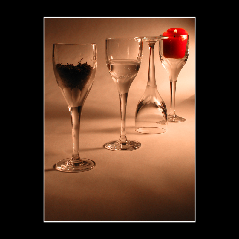
| Creative "capture" of air. Personally, not really digging the candle. |
|
|
|
01/31/2011 09:16:49 PM |
| wonderful shot. not too sure about the borders. 7 |
|
|
|
01/30/2011 11:33:08 PM |
| +1 for being brave enough to try that border. |
|
|
|
01/30/2011 01:23:42 AM |
| Of all "4 glasses" takes on 4 elements this one is the best. Apart from using perspective rather than face on I absolutely love the depiction of air! :) |
|
|
|
01/28/2011 12:46:35 PM |
| Nice idea and well produced,hope it does good. |
|
|
|
01/27/2011 03:38:13 PM |
| The upside-down glass might just get this the top mark in the elelments-in-wine-glass sub-challenge |
|
|
|
01/26/2011 11:25:24 PM |
| I think your border is way too big. The area of the border seems to be almost as large as the photo itself. everything also seems to be out of balance. sorry, I really don't like this. |
|
|
|
01/26/2011 11:21:24 PM |
| There were several wine glass entries, but the air element in this stands out. Very creative. |
|
|
|
01/26/2011 01:28:23 PM |
| Not bad. I like the way the background is lit, though it would be nice if the "earth" glass were a little brighter. Still, the highlights are controlled nicely. The angled positioning is a nice touch, but I feel like the spacing is just a tad off--the right three seem more tightly grouped than the left one. Finally, I think that it would be good if the red candle popped a little more--the rest of the image is very close to monochrome, so the one use of color should make more of a splash. |
|
|
|
01/26/2011 12:56:23 PM |
| This is a very dull photo it would be better if the colours were brighter. |
|
|
|
01/26/2011 10:54:28 AM |
Slightly different from two other images using this approach. This has the most dynamic layout, and the inverted glass is a clever choice (to trap the air :-)
I also like the edgeless bg, and the terrific, oblique lighting. But there is something a bit off on the color - the whole image seems a bit dull, lacking some sort of crispness and zing. |
|
|
|
01/26/2011 10:01:31 AM |
| nice goof on the border freaks here! |
|
|
|
01/26/2011 07:46:33 AM |
I understand what you were trying to do with the 3rd glass containing air...but feel like the reversed orientation of the glass disturbs the flow of the picture. Right side up and this would've had much more impact.
A really nice take on the challenge nonetheless! |
|
|
|
01/26/2011 12:36:27 AM |
| There is a few of these but some are done better than others. Like the setup on this one Border is a bit much though |
|
Home -
Challenges -
Community -
League -
Photos -
Cameras -
Lenses -
Learn -
Help -
Terms of Use -
Privacy -
Top ^
DPChallenge, and website content and design, Copyright © 2001-2025 Challenging Technologies, LLC.
All digital photo copyrights belong to the photographers and may not be used without permission.
Current Server Time: 03/12/2025 10:13:48 AM EDT.