| Author | Thread |
Comments Made During the Challenge  |
|
|
08/01/2004 10:35:09 PM |
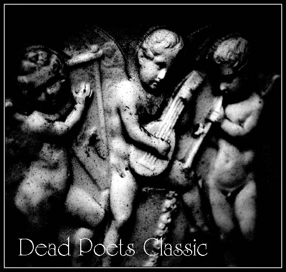
| Simple and effective. From the resolution of the uploaded version, I can't tell exactly what's going on with the lettering, could be a little pixelated. Anyway, the whole is quite satisfying. |
|
|
|
08/01/2004 01:48:48 AM |
| Very nice to look at and good design. Bumping you higher. |
|
|
|
07/31/2004 10:30:22 AM |
-
Message edited by author 2005-04-08 23:52:54. |
|
|
|
07/31/2004 09:30:08 AM |
| I would think an album cover needs to have an appealing photo and unfortunatly the subject is not appealing to me, its very dark and grainy! Sorry. |
|
|
|
07/30/2004 10:46:13 PM |
| Excellent idea and very really looking. |
|
|
|
07/29/2004 05:42:39 PM |
| Nice use of black and white. I'd prefer the font if it was smoother. It would make for a nice contrast against the grain and texture of the statues. Well done. |
|
|
|
07/28/2004 12:24:21 AM |
| You have created an effective album cover - nicely done. |
|
|
|
07/27/2004 05:10:07 PM |
| Good job. Picture goes well with the title. |
|
|
|
07/26/2004 06:55:06 PM |
| Great photo. In my humble opinion meets the challenge and has great quality. |
|
 Photographer found comment helpful. Photographer found comment helpful. |
|
|
07/26/2004 05:53:30 AM |
| Great black and white work. I would have anti-aliased the text tho to make the edges smooth. |
|
| Photographer found comment helpful. |
Home -
Challenges -
Community -
League -
Photos -
Cameras -
Lenses -
Learn -
Help -
Terms of Use -
Privacy -
Top ^
DPChallenge, and website content and design, Copyright © 2001-2025 Challenging Technologies, LLC.
All digital photo copyrights belong to the photographers and may not be used without permission.
Current Server Time: 04/26/2025 03:00:55 PM EDT.