| Author | Thread |
|
|
02/04/2011 04:31:38 PM |
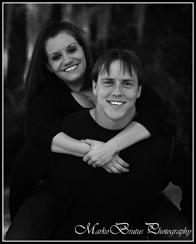
| Teeth are WAAAAY too bright!! otherwise, a very good portrait! |
|
 Photographer found comment helpful. Photographer found comment helpful. |
|
|
01/30/2011 01:28:21 PM |
I think the rest of them are really good considering what you had to work with. This one is a little flat for me. And it looks like you took advantage of the shade under the tree, so the conditions weren't awful. Did you use a fill flash? If not, that may have helped.
I agree with Kelli's comment on this one. The teeth are too bright for the rest of the shot. I think I'd dodge the faces a bit too. They're a little on the gray side. If you look at the next b&w shot, the light to dark contrast of the faces is much better and brings out their faces better. If this was a b&w conversion, you can probably bring up the brightness of the skin tones with the red and yellow channels instead of dodging. |
|
| Photographer found comment helpful. |
Home -
Challenges -
Community -
League -
Photos -
Cameras -
Lenses -
Learn -
Help -
Terms of Use -
Privacy -
Top ^
DPChallenge, and website content and design, Copyright © 2001-2025 Challenging Technologies, LLC.
All digital photo copyrights belong to the photographers and may not be used without permission.
Current Server Time: 04/18/2025 01:34:27 PM EDT.