| Author | Thread |
Comments Made During the Challenge  |
|
|
08/01/2004 06:18:48 PM |
| A dangerous font but comp and name great. Bumping you to 7 |
|
 Photographer found comment helpful. Photographer found comment helpful. |
|
|
08/01/2004 12:43:44 AM |
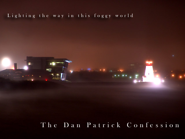
| Format should have been more square. It's hard to tell exactly what I'm looking at, except that I know it's foggy. I would have preferred if you had isolated one of the structures instead giving the broad wide angle view. I do like the eerie lighting and color. |
|
| Photographer found comment helpful. |
|
|
07/29/2004 06:34:27 PM |
| Very moody, the drop shadow text is a positive contribution. Hard to make out the buildings, but imho, not a detraction. The glare from the lights is far more important, and adds a surreal quality to the shot. Excellent. |
|
| Photographer found comment helpful. |
|
|
07/28/2004 09:38:13 AM |
| Very smooooooooooooth feel to this. Good job at creating this effect. Right down to the text. Love the name too.....very cool. |
|
| Photographer found comment helpful. |
|
|
07/27/2004 08:10:56 PM |
| Nice colors and placement. It looks like you planned the negative space for the text - well done. |
|
| Photographer found comment helpful. |
|
|
07/26/2004 01:06:20 PM |
| Ech! The band name has the cheesy ring of current so-called alternative. Which means it works! The cover is kind of boring. The layout is good. |
|
| Photographer found comment helpful. |
|
|
07/26/2004 06:01:32 AM |
| No real point of interest here, but for an album cover challenge that's no problem. Abstracts can work really well. I like this shot a lot. |
|
| Photographer found comment helpful. |
Home -
Challenges -
Community -
League -
Photos -
Cameras -
Lenses -
Learn -
Help -
Terms of Use -
Privacy -
Top ^
DPChallenge, and website content and design, Copyright © 2001-2025 Challenging Technologies, LLC.
All digital photo copyrights belong to the photographers and may not be used without permission.
Current Server Time: 03/13/2025 12:44:27 AM EDT.