| Author | Thread |
|
|
08/05/2004 02:30:09 AM |
| This is a great photo. I'm very surprised that it didn't do better. It might have been the format like you said... |
|
 Photographer found comment helpful. Photographer found comment helpful. |
|
|
08/02/2004 12:33:48 AM |
| cool photo gordon ... love the tone's on this |
|
| Photographer found comment helpful. |
Comments Made During the Challenge  |
|
|
08/01/2004 01:35:49 AM |
| Expertly done woth great title and graphics. I voted earlier and bumping you higher. |
|
| Photographer found comment helpful. |
|
|
07/29/2004 05:39:18 AM |
| Took me a moment to see the second face ... which really adds to it. Nice work. |
|
| Photographer found comment helpful. |
|
|
07/28/2004 03:18:30 AM |
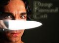
| Nice concept..however, I expect he title to be printed in the cover. It is a good picture though. The underexposure works. 9 |
|
| Photographer found comment helpful. |
|
|
07/27/2004 08:47:38 PM |
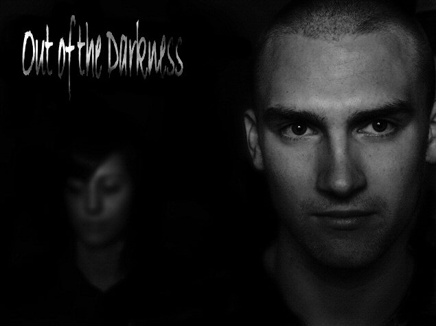
| Wonderful. I really like the way you composed the portraits! The female is very mysterious - and the male quite striking. The only small detractor is the words "out of" seem to be a bit hot. Should finish very high - but gosh - there a LOTS of great submissions. |
|
| Photographer found comment helpful. |
|
|
07/26/2004 11:31:31 PM |
| I love the photo, but the text effect isn't doing it for me. It seems to really detract from the composition. |
|
| Photographer found comment helpful. |
|
|
07/26/2004 05:38:22 PM |
Awesome photo! Band name is so so...I feel you could've done a better job of matching name to picture.
Still, on the merits of the photo...an "8"
Love the font. |
|
| Photographer found comment helpful. |
|
|
07/26/2004 05:29:21 PM |
| Superb design - remind me of some of Arnit's work (not in the sense of being copied but in the sense of creativity and in the ability to express enigma in portraiture). Not keen on the font choice but it's not awful either. 9 |
|
| Photographer found comment helpful. |
|
|
07/26/2004 02:49:41 PM |
| this is so werid - you two guys look almost exactly like superb band Lamb. this so very fits the challenge! i'm not greatly keen on the font - something a bit less, erm, scruffy (?) might suit a little better - something like the one i'm typing this out with, and in one bold colour. possibly not so big. that aside, i think it's dead impressive - and your models looks and poses are SO right for the band name. bravo you. for the photo - 10. but the title IS part of the overall look this week, so i think it feels more an 8. |
|
| Photographer found comment helpful. |
|
|
07/26/2004 01:58:55 PM |
| I love this. This is so modern, so today, so perfect. Simple, clean and the lettering size and placement is perfect. A 10 |
|
| Photographer found comment helpful. |
|
|
07/26/2004 12:59:20 PM |
| Good band title. It sounds natural and authentic. The photo is perhaps a bit too dark. The foreground subject should have a bit lighter middle values in greater contrast with the shadows. And the other face should be a teensy bit more visible. I don't like the font choice at all. |
|
| Photographer found comment helpful. |
|
|
07/26/2004 06:39:39 AM |
| Good composition and DoF. I think this will appear too dark on a lot of people's monitors and they won't even see the person in the background, which is a shame, cos the darkness is what makes the shot. |
|
| Photographer found comment helpful. |
|
|
07/26/2004 12:46:36 AM |
| This is really cool, I like the idea and the lighting/darkness. Great job... |
|
| Photographer found comment helpful. |