| Author | Thread |
|
|
08/02/2004 11:50:29 AM |
| I can't understand why you didn't get a ribbon, this was my favorite shot here and very professional looking. |
|
 Photographer found comment helpful. Photographer found comment helpful. |
|
|
08/02/2004 12:21:04 AM |
| Congratulations on your 7th placing. Great effort with expert presentation. |
|
| Photographer found comment helpful. |
Comments Made During the Challenge  |
|
|
08/01/2004 10:46:22 PM |
| Great job on the photo! I like it. |
|
| Photographer found comment helpful. |
|
|
08/01/2004 10:28:36 PM |
| I'm a sucker for a good silhouette photo. Very well conceived and executed composition. |
|
| Photographer found comment helpful. |
|
|
08/01/2004 10:28:36 PM |
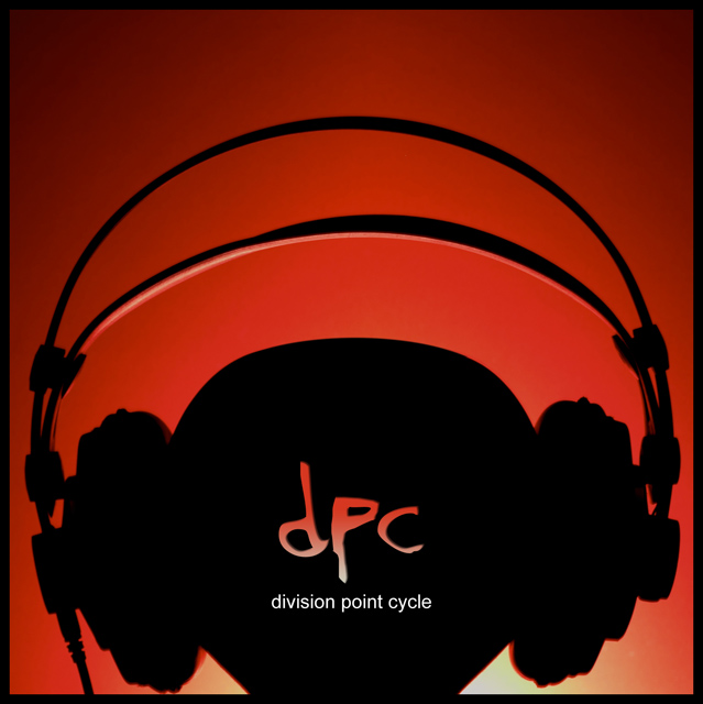
| The third album cover that isn't crap. Like the lighting alot. Good use of text. |
|
| Photographer found comment helpful. |
|
|
08/01/2004 10:09:25 PM |
Only way to describe this.... Perfect.
The DPC acronym, simplicity in design, and urban feel scream album cover.
Photographically, the composition, use of lighting, and color palette totaly work. One of my pics for a ribbon..... 10 |
|
| Photographer found comment helpful. |
|
|
08/01/2004 02:29:27 PM |
| The band name is believable and pretty likable. The photo is wonderful. Colors, idea, and composition are all excellent. Nice work. |
|
| Photographer found comment helpful. |
|
|
07/31/2004 12:11:30 PM |
|
| Photographer found comment helpful. |
|
|
07/30/2004 07:20:46 AM |
Thats a cool idea...
Have you seen the sign from "mynestry of sound" ?
It´s almost just the same..
|
|
|
|
07/28/2004 01:44:29 PM |
| Love this image, one of my favourites. |
|
| Photographer found comment helpful. |
|
|
07/27/2004 08:11:53 PM |
| A very nice graphic - that could easily be an album cover. Well done. |
|
| Photographer found comment helpful. |
|
|
07/27/2004 05:44:51 AM |
|
| Photographer found comment helpful. |
|
|
07/26/2004 11:33:02 PM |
| Great graphical editing. I love the negative effect with "dpc" and the background. Overall a great cover. If I had to nitpick, I'd suggest a slightly lighter font -- I'm guessing that's Arial, and it seems just a bit heavy to me personally. 8. |
|
| Photographer found comment helpful. |
|
|
07/26/2004 08:44:14 PM |
| Cool and simple. I like the silhouette and the red background. The lighting is great. (9) |
|
| Photographer found comment helpful. |
|
|
07/26/2004 07:08:08 PM |
|
| Photographer found comment helpful. |
|
|
07/26/2004 07:04:42 PM |
| Great color. Great perspective. Different and engaging. |
|
| Photographer found comment helpful. |
|
|
07/26/2004 05:34:21 PM |
Excellent job. Lighting makes the focus look soft but not much.
"8" |
|
| Photographer found comment helpful. |
|
|
07/26/2004 12:36:16 PM |
| one of the best designs this week. the simplicity makes it work. |
|
| Photographer found comment helpful. |
|
|
07/26/2004 10:48:38 AM |
| Damn... I hope you win. This is what an album should look like. .:10:. |
|
| Photographer found comment helpful. |
|
|
07/26/2004 07:38:18 AM |
| This shot is great with really effective lighting. The text is also really cool. 10 & adding to favs |
|
| Photographer found comment helpful. |
|
|
07/26/2004 04:08:11 AM |
| This is fantastic, I want to vote highly for it but i'm not a paying member (can't vote) so i just had to leave a comment so i could give it some sort of recognition. |
|
| Photographer found comment helpful. |
|
|
07/26/2004 12:30:50 AM |
| Beautiful shot. Backlit profiles look great when done well. |
|
| Photographer found comment helpful. |
Home -
Challenges -
Community -
League -
Photos -
Cameras -
Lenses -
Learn -
Help -
Terms of Use -
Privacy -
Top ^
DPChallenge, and website content and design, Copyright © 2001-2025 Challenging Technologies, LLC.
All digital photo copyrights belong to the photographers and may not be used without permission.
Current Server Time: 04/27/2025 03:41:44 AM EDT.