| Author | Thread |
Comments Made During the Challenge  |
|
|
03/18/2011 03:32:51 PM |
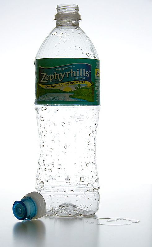
| I wish the colors on the label were a bit more vibrant they seem a little muted. |
|
|
|
03/18/2011 02:35:11 PM |
|
|
|
03/18/2011 11:26:23 AM |
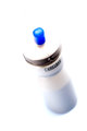
| Would have been nicer if the lable wasnt so dark, but the overall shot has good effect. 6 |
|
|
|
03/17/2011 06:11:16 PM |
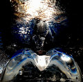
| The challenge said: "Use a water bottle in your entry" but it did not mean "do not photograph anything else". This picture does not give the viewer much other than a few droplets and since I marked it under 5 I had to say why. |
|
|
|
03/17/2011 05:40:45 PM |
| It's a little overexposed in my opinion, you almost lost the lines that define the body of the bottle. |
|
|
|
03/16/2011 10:34:42 PM |
|
Home -
Challenges -
Community -
League -
Photos -
Cameras -
Lenses -
Learn -
Help -
Terms of Use -
Privacy -
Top ^
DPChallenge, and website content and design, Copyright © 2001-2025 Challenging Technologies, LLC.
All digital photo copyrights belong to the photographers and may not be used without permission.
Current Server Time: 03/11/2025 12:59:13 PM EDT.