| Author | Thread |
Comments Made During the Challenge  |
|
|
08/07/2004 06:34:05 PM |
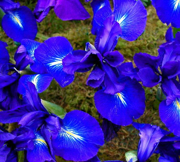
| I don't know if you actually did, but this image screams oversaturation. It really looks like you ramped blue up way too much. The confusing pattern also creates a lack of focal interest: the eyes wander all over the image without finding any single point to be drawn to. Keep experimenting. |
|
|
|
08/06/2004 12:51:14 PM |
| I think this picture might have been oversaturated (purple showing up on petals). Also I think the face-on angle isn't very interesting to the viewer. |
|
|
|
08/06/2004 10:41:44 AM |
| Its too busy. There is no focal point for the picture |
|
|
|
08/06/2004 06:06:36 AM |
| Thats some really bad cloning. Might want to skip the solid brushes from now on and use one with a softer edge. |
|
|
|
08/06/2004 01:25:31 AM |
| Colors are very rich and almost too rich. Maybe you oversharpened and cranked the saturation up, too. Not sure if my eyes are seeing correctly but I see some weird circular shapes up near the top middle and in the right corner. Maybe you cloned some odd bits out. I also think the background could have used more shallow DOF to make it less distracting. |
|
|
|
08/05/2004 04:37:02 PM |
|
|
|
08/05/2004 12:30:13 AM |
| colors seem off, maybe over saturated |
|
|
|
08/04/2004 01:30:31 PM |
|
|
|
08/04/2004 09:46:48 AM |
| nice effort, but unfortunately for me, it's not working too well. too much blue and too much busy background. |
|
|
|
08/03/2004 01:51:48 PM |
| the way in which you have composed your shot makes it very cluttered looking. your picture would be much stronger if you composed the shot in such a way that you seperate your subject from the surroundings. |
|
|
|
08/02/2004 05:19:18 PM |
| Background detracts from the blossoms. Colors seem flat. Too many blossoms to focus interest on (my eye just keeps flying around the image with no place to settle.) Possibly focusing on a single flower, shallowing DOF and some extra side-lighting would have helped. |
|
|
|
08/02/2004 05:10:13 PM |
| the color is a bit strong |
|
|
|
08/02/2004 11:27:09 AM |
| Beautiful color and sharpness! |
|
 Photographer found comment helpful. Photographer found comment helpful. |
Home -
Challenges -
Community -
League -
Photos -
Cameras -
Lenses -
Learn -
Help -
Terms of Use -
Privacy -
Top ^
DPChallenge, and website content and design, Copyright © 2001-2025 Challenging Technologies, LLC.
All digital photo copyrights belong to the photographers and may not be used without permission.
Current Server Time: 03/18/2025 03:30:41 PM EDT.