All critique would be gratefully appreciated no matter how harsh, as long as you can comment how I could improve it for next time.
(PLEASE NOTE A LOT OF COMMENTS ARE THE SAME AS Chris_001 AS THEY ARE PART OF THE SAME SET)
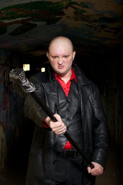
Set Up Summary:-
- 60" Umbrella - Reflective cover removed, but shot as reflective, i.e. not shoot through.
- YN-560 Flash @ Full Power
- Nikon D90
- Nikkor 35mm, f1.8 G lens @ 50mm (crop factor) f4.5
- ISO 200
- Shutter Speed 1/200
- Light position - face on, model/camera high
(No Post Processing has been done because I am not sure what/how to do that would improve it in aperture 3 or elements yet). Any suggestions gratefully appreciated.
I had one option only with the light source, I was shooting into the tunnel which was only a little higher than Chris, about 6ft in total. I had a 60" umbrella and shot it cover off, reflective side, so not shoot through. About a 5th of the umbrella was higher than the tunnel roof so I had to set it up just outside the entrance to the tunnel. Chris is about 2-3 meters or so into the tunnel while I am position under the light source. The path towards the tunnel was a downward gradient so moving the umbrella back would have raised it higher.
My Considerations:-
I had a play with the different levels and angles of the umbrella. To high and it would not pick up the roof, to low and if would fire to far down the tunnel.
I wanted to get the flash to fire down the tunnel just past Chris and to filter off. I achieved this but not sure how much I like the result yet.
I wanted to use the walls and roof as lead in lines.
I wasn't sure what or how to work with the wall lights and annoyingly I positioned Chris with his ear intersecting one. Point to learn, watch all scene for composition. I was more focused on the light to subject distance as I was on full power.
My exposure was a 3rd of a stop than my Chris_001 which has given a lighter affect on him.
My Thoughts:-
I am partly happy with this image because it is what I set out for.
I think Chris stands out better from the background in this image, more so than the others but it still loses something I feel having black on black.
I also think he looks too flat on the image. Suggestions made on Chris_001 is to add a backlight, I will try this.
His pose is better than Chris_001, but I still want to work on it.
I changed orientation to try and see how a change would feel to the image, and I prefer the portrait to landscape orientation. Still needs a lot more work though.
As mentioned before the lights were a pain so I need to compensate better in my composition.