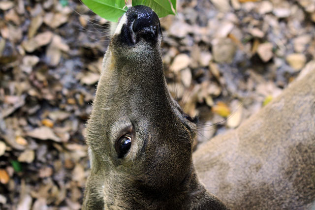
I'd say this is one of those photos that has a "cute" factor attached to it, which may be somewhat appealing, but it suffers from some technical and stylistic difficulties that are probably resulting in a lower score.
Most obvious is the awkward position of the animal's head. Though leaves are in view, it's not immediately obvious that it's being fed, and it actually looks a little uncomfortable. I think that's slightly alienating for the viewer. The head's position also makes for an awkward composition, as it slices the photo virtually in half in a way that is not particularly appealing. The composition is very cramped, and whereas that is a style choice in many cases (see the Edward Weston challenge), it is unconscious here, and therefore doesn't work well. The background is exceedingly busy, and detracts overall. Had it been more out of focus, we'd be able to at least ignore it a bit more and concentrate on the subject. Overall, the colour is drab and muted, not generally conducive to a "cute animal" shot. Finally, the photo is more of a snapshot than a well thought-out image. We don't feel any investment from you, the photographer, in this image. If you had somehow told a story, or offered your view on something with this, or communicated something tangible, you would have succeeded. All of those things are for you to decide, however.
To improve the shot as is, you could have worked on the tone levels in post, sharpened it a bit more, and selected and blurred the background out. It would still have suffered from many of the compositional and stylistic problems I've mentioned, but you could have improved some of the technicals in order to get your score up a few ticks.
My best advice for any photographer is invest in your photos; invest in your imagery; ask yourself why you are taking your picture; and tell us the story of that picture, once it has meaning for you. |