| Author | Thread |
|
|
12/23/2002 11:55:49 AM |
~~~~Critique Club Comment~~~~
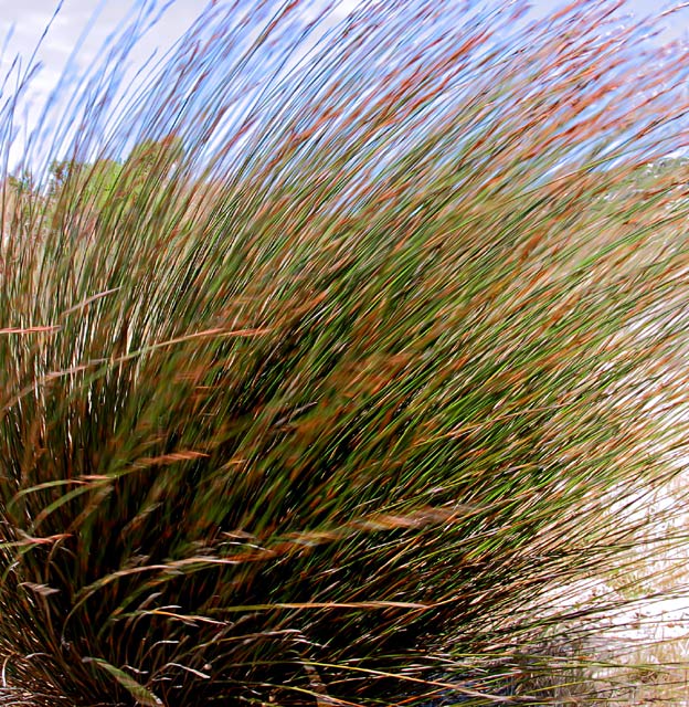
Composition (content)
The strong point of this image is the texture created by the motion blur. The subject fills the frame well and the layers of colors (bright blue sky, light brown, green, dark green&brown) enhance the picture. Another good thing is the diagonal from the lower left to the upper right, created by the wind blowing against the 'grass'.
Background
The background gives some context to the foreground subject without taking the view from the subject away. You see a tree at the left and right, the skyline and some sand at the right. It is a bit sharp though, you migh have wanted to blur that by choosing a smaller aperture, but with the ISO already at 50 that would cause a to fast shutter. So you made the right decision.
Camera Work (Technical)
Good exposure. I have my doubts about the sharpness. There seem to be a lot of sharpening artifacts, don't know if that is caused by the camera or by post processing. Or could that be jpeg artifacts because there is so much detail that the quality level at 150kb is still to low?
Digital Processing (technical)
See camera work.
My opinion
It is a good shot, but I my eyes physicaly hurt when I look at it (not meant as a bad thing! I scored it a 7 originally.). Perhaps it needs one fixed point for reference.
Good exposure, but there is too much digital clutter.
Message edited by author 2002-12-23 12:53:15. |
|
Comments Made During the Challenge  |
|
|
12/15/2002 02:38:03 PM |
1)Does the Photo fit the theme?(3)
2)Color(4)
3)Composition(4)
4)Focus(3)
5)Background(3)
6)Lighting(4)
7)Title(4)
Overall Score:3.57 rounded to 4
Commentary:
Focus here goes without saying. I think that you had an opportunity for a good shot. Personally, and this is my oppinion, I feel that the focal point is not worthy for a motion challenge. I am not saying that the Idea is bad. Not just one I would have experimented with. I think with a little bit ofe tweaking and a different theme in mind you could turn this bad boy into a postcard. Is there a Lighthouse on the other side of this grass. Now that would be a nice shot. Pull back a bit to expose a lighthouse behind the grass.
John (TurboTech) |
|
|
|
12/15/2002 10:53:42 AM |
| The motion and colour are excellent. Very fluid. |
|
|
|
12/14/2002 02:58:50 AM |
| Great texture, motion and color. Nice composition too. |
|
|
|
12/12/2002 07:57:53 PM |
| Now THIS is my kinda feel good image. I can practically lick that breeze. Absolutely wonderful texture. I would personally like to see more of these chuck the super tack focus out the window. And wallow real serious into emotive color and texture blends like this superb image. 8...bullwinkle |
|
|
|
12/12/2002 08:42:07 AM |
| i like the painterly affect this has. it feels like a monet painting from the impressionist period! |
|
|
|
12/11/2002 11:38:16 AM |
Great capture of sweeping motion. I like the composition too.
8 |
|
|
|
12/10/2002 04:36:04 PM |
| Kinda interesting. Is this Cornwall, by chance? |
|
|
|
12/10/2002 05:14:01 AM |
| Like it: exposure is set just right so the gras is not totally blurred. One almost feels the wind blow. Also like the light. |
|
|
|
12/10/2002 01:56:12 AM |
|
|
|
12/09/2002 11:40:27 PM |
| Oh I like this shot. good use of the new image size rules. The large size of the shot looks good. Overall well done. |
|
|
|
12/09/2002 10:04:42 PM |
| Very nice color contrast - almost Monet-ish. |
|
|
|
12/09/2002 08:42:20 PM |
|
|
|
12/09/2002 12:41:29 PM |
|
|
|
12/09/2002 01:25:48 AM |
| Very cool! I especially like the transition in colors of the stems! Everything is moving! heh |
|
Home -
Challenges -
Community -
League -
Photos -
Cameras -
Lenses -
Learn -
Help -
Terms of Use -
Privacy -
Top ^
DPChallenge, and website content and design, Copyright © 2001-2025 Challenging Technologies, LLC.
All digital photo copyrights belong to the photographers and may not be used without permission.
Current Server Time: 03/13/2025 05:30:19 AM EDT.