| Author | Thread |
|
|
04/17/2011 03:03:30 AM |
Originally posted by bvy:
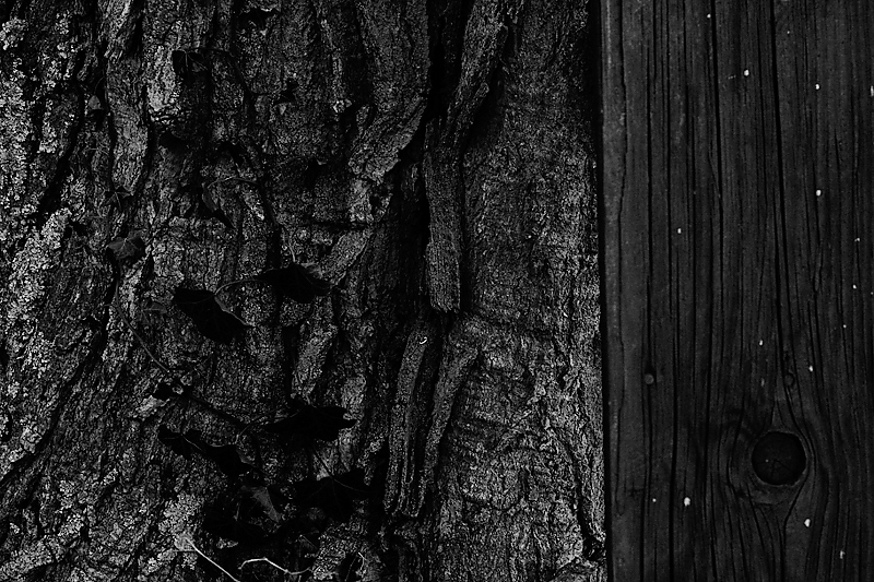
The careful viewer is rewarded with the z-axis. This image is very three dimensional. |
Moral to self: Take more care! |
|
 Photographer found comment helpful. Photographer found comment helpful. |
|
|
04/16/2011 04:34:14 PM |
| The careful viewer is rewarded with the z-axis. This image is very three dimensional. |
|
| Photographer found comment helpful. |
|
|
04/16/2011 12:31:21 PM |
Greeting for the Critique Club:
Typical! First few goes at this Critique Club thing and I get one of yours! Baptism of fire (fitting then, that the wood appears charred!)
OK - time to 'fess up, I gave this a 3 in voting (I've said it now): hopefully the things I didn't like about it are the things that appeal to you.
I'll start off with what I did like - the deep blacks, they have an unusual richness about them, almost luxurious and indulgent, I quite like the white flecks of the wood too and how they suggest a constellation.
So, why the low score... It is of course a very two dimensional piece, completely minimalist in the Z axis, I feel the image acts like a bit of a wall, keeping the viewer out rather than inviting us in to explore. I wonder if the dark, dark tones compound this effect - this image feels like a no go area (no viewers allowed - move on). In voting, that's what I did - I hit you with a bit of a drive-by vote. No such copping out here though.... Being 'forced' to write a long comment is allowing me sufficient time to engage with it and I do declare, its a bit of a grower. If I think back to the challenge brief - all that stuff about light and shade and texture and form - well you've nailed all that.
One thing I do note as I look at it is that I think I would prefer it rotated 90 degrees clockwise. Years ago I had a previous life in geology and with the rotation your image offer nostalgic suggestions of rock strata - the juxtaposition of materials, tree, wood and (suggestion of) rock appeals to me.
Paul
|
|
| Photographer found comment helpful. |
|
|
04/11/2011 12:05:13 AM |
| nice composition and love the dark feeling. |
|
| Photographer found comment helpful. |
Comments Made During the Challenge  |
|
|
04/08/2011 09:45:27 AM |
|
| Photographer found comment helpful. |
|
|
04/06/2011 07:50:28 AM |
| Good textures, good contrast of subjects |
|
| Photographer found comment helpful. |
|
|
04/05/2011 11:00:01 PM |
| Excellent study of textures; lovely tones as well. |
|
| Photographer found comment helpful. |
|
|
04/05/2011 08:59:30 AM |
|
| Photographer found comment helpful. |
|
|
04/05/2011 12:15:27 AM |
|
| Photographer found comment helpful. |
|
|
04/04/2011 09:03:28 PM |
| ha, great title! I like the shot too. |
|
| Photographer found comment helpful. |
|
|
04/04/2011 06:20:17 PM |
|
| Photographer found comment helpful. |
|
|
04/04/2011 12:55:43 PM |
| I'm not catching your artistic vision and connection with the title. It's not you, it's me. I kind of relate the board to the tree and think you meant something by that difference. Even though the meaning is lost, you got good texture but it's a little dark overall. |
|
| Photographer found comment helpful. |
|
|
04/04/2011 01:08:17 AM |
| There is something a bit odd about this image, as though the left portion is over-sharpened. |
|
| Photographer found comment helpful. |
Home -
Challenges -
Community -
League -
Photos -
Cameras -
Lenses -
Learn -
Help -
Terms of Use -
Privacy -
Top ^
DPChallenge, and website content and design, Copyright © 2001-2025 Challenging Technologies, LLC.
All digital photo copyrights belong to the photographers and may not be used without permission.
Current Server Time: 03/10/2025 10:41:59 PM EDT.