| Author | Thread |
|
|
04/17/2011 01:10:59 PM |
Greetings from the Critique Club:
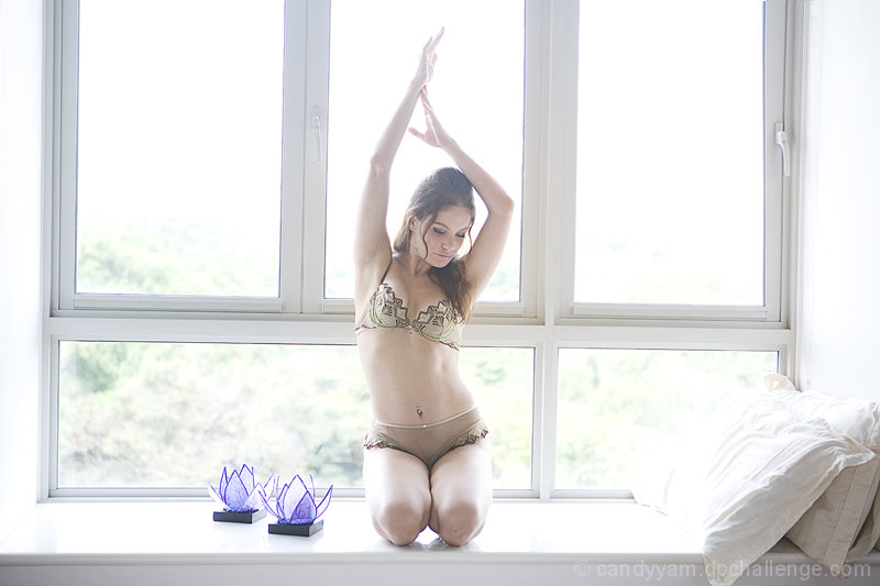
I think this may be the same model from your recent Librodo entry so you already know I'm a fan and of course she looks lovely here. This images doesn't have the power your 'Woman' image though and doesn't seem to be finished to the same standard. I can see how the shelf is horizontal but your POV has introduced some geometric distortion of the frame which does detract from the image.
Personally, I do like the bright light and feel it could have been emphasised even more. I'm not a fan of your crop though - your model is too good to make her this small on the screen to include some cushions...!
The critical question for this image is whether it fits the 'Fine Art' genre - for me, I'm not sure it did; it may have been effective within a wider Free Study brief but for me lacks the imagination that underpins much of the Fine Art work.
However, there's no denying that this is an effective image in a less loaded context.
Paul |
|
Comments Made During the Challenge  |
|
|
04/12/2011 08:39:42 PM |
Lovely... not sure about the off-kilterness of it... Seems like the windows could have been skewed to be level if not shot that way... still... I like this.
I like the colors... but the purple... catches my eye and won't let go... keeping me from the subject. (not voting) |
|
|
|
04/11/2011 11:50:12 AM |
| Background is too blown out. |
|
|
|
04/09/2011 01:53:53 AM |
| Nice pose, very lovely model |
|
 Photographer found comment helpful. Photographer found comment helpful. |
|
|
04/08/2011 07:36:34 PM |
| The angle of the window is distracting... |
|
|
|
04/08/2011 05:54:33 PM |
| The blinding light and the tilt really subtract from this image. |
|
Home -
Challenges -
Community -
League -
Photos -
Cameras -
Lenses -
Learn -
Help -
Terms of Use -
Privacy -
Top ^
DPChallenge, and website content and design, Copyright © 2001-2025 Challenging Technologies, LLC.
All digital photo copyrights belong to the photographers and may not be used without permission.
Current Server Time: 04/26/2025 08:50:34 AM EDT.