| Author | Thread |
|
|
04/25/2011 06:47:19 PM |
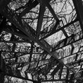
| Nice graphic quality to this... |
|
 Photographer found comment helpful. Photographer found comment helpful. |
Comments Made During the Challenge  |
|
|
04/20/2011 03:27:32 PM |
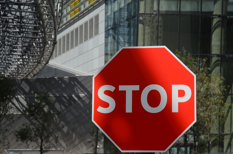
| spanking new stop sign :) |
|
| Photographer found comment helpful. |
|
|
04/18/2011 06:38:30 PM |
| Wow, that stop sign is very stark looking. |
|
| Photographer found comment helpful. |
|
|
04/18/2011 12:02:01 PM |
| My opinion, but I would have worked at not having shadows on a stop sign, and second, I think there's a bit too much space at right and not enough at bottom an left. Even just lining up the right side close to the sign, as you have it at bottom now, might work better. Not sure though. ~6 |
|
| Photographer found comment helpful. |
Home -
Challenges -
Community -
League -
Photos -
Cameras -
Lenses -
Learn -
Help -
Terms of Use -
Privacy -
Top ^
DPChallenge, and website content and design, Copyright © 2001-2025 Challenging Technologies, LLC.
All digital photo copyrights belong to the photographers and may not be used without permission.
Current Server Time: 03/12/2025 02:38:39 AM EDT.