| Author | Thread |
|
|
08/15/2004 01:20:52 PM |
Greetings from the Critique Club
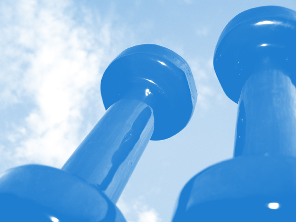
The simplicity and unique point of view are what make this photo interesting. Nice balanced composition. The overall tone seems a bit light; I think making the dark parts a bit darker would add more impact. The blue color was obviously inspired by the challenge topic, and it does work well but at the same time it seems a bit artificial. A slightly different hue of blue would work better I think. (Or maybe an entirely different color, like gold, but that wouldn't meet the challenge!) Also, some of the specular highlights are a bit large; they would be less distracting if made a bit smaller, either by adjusting the lighting or some minor retouching in Photoshop.
Focus is great, with just the right depth of field; having the bases of the dumbbells slightly blurry is perfect, adding to the illusion that they are very tall. |
|
Comments Made During the Challenge  |
|
|
08/08/2004 07:49:17 PM |
| I would have liked this better if the blue was darker, good idea though |
|
 Photographer found comment helpful. Photographer found comment helpful. |
|
|
08/05/2004 05:53:30 AM |
| Interesting exposure. The weights feel like tall towers to me. |
|
| Photographer found comment helpful. |
|
|
08/03/2004 09:54:09 AM |
| No contrast, can barely make out what it is. |
|
| Photographer found comment helpful. |
|
|
08/02/2004 07:40:50 PM |
| neat perspective. Could have used some more contrast. |
|
| Photographer found comment helpful. |
Home -
Challenges -
Community -
League -
Photos -
Cameras -
Lenses -
Learn -
Help -
Terms of Use -
Privacy -
Top ^
DPChallenge, and website content and design, Copyright © 2001-2025 Challenging Technologies, LLC.
All digital photo copyrights belong to the photographers and may not be used without permission.
Current Server Time: 03/13/2025 02:04:21 AM EDT.