| Author | Thread |
Comments Made During the Challenge  |
|
|
08/06/2004 06:34:52 AM |
| Beautiful idea but the slanted reference line is a distraction. |
|
|
|
08/05/2004 09:18:11 PM |
| too symmetric which in turn makes the composition boring. and there really isnt a central point of focus, seems just like 3 objects on a flat reflective surface, placed in a very forced fashion |
|
|
|
08/04/2004 12:17:26 PM |
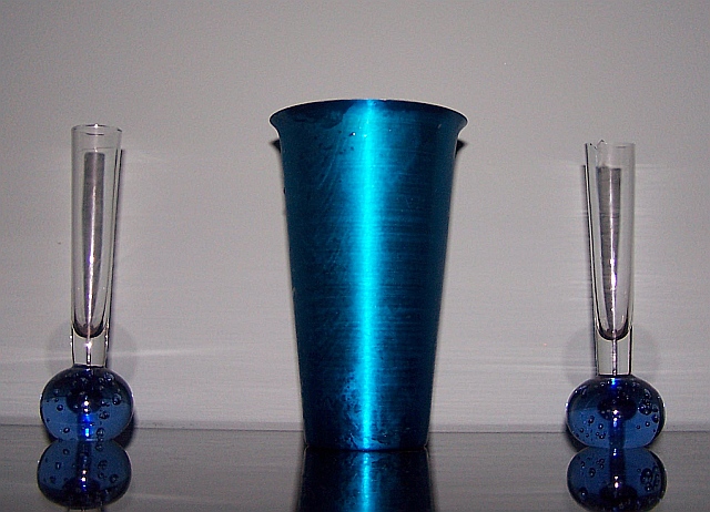
Nice balanced composition. Main problem is the lighting, it's not very interesting coming from the front like that. Too flat and harsh. Is it on-camera flash? (The round shadows made on the wall above the bases of the skinny vases are funny, made by the flash's reflection in the table.)
If lit by natural window light or some nicely diffused indirect lighting, it could be much better. The right vase has some cracked out chunks up top that are distracting. |
|
 Photographer found comment helpful. Photographer found comment helpful. |
|
|
08/03/2004 05:43:12 PM |
| I would play around with the lighting on this one |
|
| Photographer found comment helpful. |
Home -
Challenges -
Community -
League -
Photos -
Cameras -
Lenses -
Learn -
Help -
Terms of Use -
Privacy -
Top ^
DPChallenge, and website content and design, Copyright © 2001-2025 Challenging Technologies, LLC.
All digital photo copyrights belong to the photographers and may not be used without permission.
Current Server Time: 03/13/2025 02:15:16 AM EDT.