| Author | Thread |
|
|
08/14/2004 01:34:27 PM |
from the critique club:
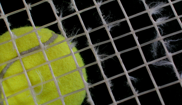
What went wrong here? It happens to all of us. Here you have a good amount of diagonal lines and a ball well placed. You accomplished the intent of "frayed", but the image fails to pull the eye. It is all in the choice of lighting.
By looking at your port I note that you are very competent in hamdling light. Your TP is a winner, right into my favs.
This image is a nice composition but I think you should have addressed the lighting with one of your unique ideas. This would certainly benefit with the use of backlight, however, I leave that up to you.
It is very simple: you had a very good idea and you made a good composition...you simply did not spend enough time with final outcome.
TP is your bench mark. Always try to top your best next time around. |
|
 Photographer found comment helpful. Photographer found comment helpful. |
Comments Made During the Challenge  |
|
|
08/06/2004 02:24:46 AM |
| There does not seem to be a center of attention (a specific part of the image the eyes are drawn to). The frayed strings indicate a lot of use, but the image is quite static. If the ball had been pressed into the strings I think it would have provided a stronger focus for attention. |
|
| Photographer found comment helpful. |
|
|
08/02/2004 04:57:26 PM |
| Good workman like photo but the subject isn't that interesting. Perhaps a different composition would raise the interest factor. Lighting seems a bit flat. Stronger shadows of the strings might have given the photo greater depth. |
|
| Photographer found comment helpful. |
Home -
Challenges -
Community -
League -
Photos -
Cameras -
Lenses -
Learn -
Help -
Terms of Use -
Privacy -
Top ^
DPChallenge, and website content and design, Copyright © 2001-2025 Challenging Technologies, LLC.
All digital photo copyrights belong to the photographers and may not be used without permission.
Current Server Time: 03/14/2025 01:02:58 AM EDT.