| Author | Thread |
Comments Made During the Challenge  |
|
|
08/08/2004 07:50:51 PM |
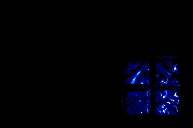
| Too much black space, not enough interesting subject to look at. |
|
|
|
08/08/2004 01:27:54 AM |
| What there is of the blue glass seems pretty nice but 90 % of the image has nothing. |
|
|
|
08/04/2004 01:29:28 AM |
| Great texture and color here. It leaves the rest of the image up the viewer's imagination... |
|
 Photographer found comment helpful. Photographer found comment helpful. |
|
|
08/03/2004 11:34:28 PM |
| I like the idea and the composition. It does appear a little dark, tho. I don't know enough about photography yet to give concrete suggestions. |
|
| Photographer found comment helpful. |
|
|
08/02/2004 03:23:42 AM |
| Too much dead space, in my opinion. I like the window in the corner, but I don't see a need for all the negative space. Would be very cool to have the glass fill the frame. 6. |
|
| Photographer found comment helpful. |
Home -
Challenges -
Community -
League -
Photos -
Cameras -
Lenses -
Learn -
Help -
Terms of Use -
Privacy -
Top ^
DPChallenge, and website content and design, Copyright © 2001-2025 Challenging Technologies, LLC.
All digital photo copyrights belong to the photographers and may not be used without permission.
Current Server Time: 03/12/2025 10:44:15 AM EDT.