| Author | Thread |
|
|
08/11/2004 09:02:15 AM |
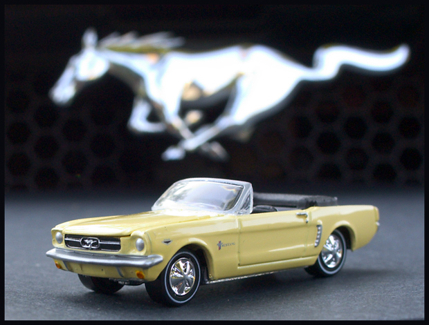
I bet if the Mustang was red and your focus was just a tad deeper, so all the car was in focus, this would have scored a point higher. As you already know, DPC voters like purty colors.
Great idea though. |
|
 Photographer found comment helpful. Photographer found comment helpful. |
Comments Made During the Challenge  |
|
|
08/09/2004 03:16:20 AM |
|
| Photographer found comment helpful. |
|
|
08/08/2004 09:43:07 PM |
|
| Photographer found comment helpful. |
|
|
08/05/2004 09:46:55 PM |
| Top notch, very clever...I love it. The car would have really stood out in more vibrant color, nonetheless great composition! Good luck! |
|
| Photographer found comment helpful. |
|
|
08/05/2004 09:02:02 PM |
| good luck. one of my top picks. wish it wasn't so washed out, though. |
|
| Photographer found comment helpful. |
|
|
08/05/2004 01:03:54 PM |
| Shame about the title. Hope people aren't voting you low because of it... great shot |
|
| Photographer found comment helpful. |
|
|
08/05/2004 11:44:07 AM |
| It meets the challenge but it doesn't do anything for me. Maybe if it was closer to emblem on the real car, or if the grill on the real one was more in focus |
|
| Photographer found comment helpful. |
|
|
08/05/2004 01:18:34 AM |
| Super concept. Very well done! Wish the light on the mustang model had been a little softer. |
|
| Photographer found comment helpful. |
|
|
08/04/2004 06:39:16 PM |
| Without the title I wonder how many people would know this was setting on the bumper? Nice shot, but a little blurry on the tail end of the car. |
|
| Photographer found comment helpful. |
|
|
08/04/2004 04:45:16 PM |
| Nice composition and creative. Focus could of been a bit better. 8 |
|
| Photographer found comment helpful. |
|
|
08/04/2004 01:51:43 PM |
| some of the light areas seem overexposed. the idea is a good one but the presentation isnt as strong as could have been... the fact that the car and the horse are almost the same size makes the balance boring. |
|
|
|
08/04/2004 01:38:57 PM |
| Nice picture -- wordy title. It looks like you've adjusted the exposure for the background, not the subject: a touch more density inthe midrange would give the car a nice solid feel, it's a little washed out as-is. Highlights are over-exposed. |
|
| Photographer found comment helpful. |
|
|
08/04/2004 11:01:14 AM |
| Can't tell if it is the texture of the car, or your focus that makes this look a bit soft... Also, I think you mean "BumPer" :-) 6 |
|
| Photographer found comment helpful. |
|
|
08/04/2004 08:44:28 AM |
| great idea and great execution...9 |
|
| Photographer found comment helpful. |
|
|
08/04/2004 02:14:49 AM |
| Nice blurry pony on backgound! |
|
| Photographer found comment helpful. |
|
|
08/04/2004 02:10:04 AM |
| That's mini alright. Good shot ! |
|
| Photographer found comment helpful. |
|
|
08/04/2004 12:55:24 AM |
| Nice concept. It appears that the model is not quite in focus. |
|
Home -
Challenges -
Community -
League -
Photos -
Cameras -
Lenses -
Learn -
Help -
Terms of Use -
Privacy -
Top ^
DPChallenge, and website content and design, Copyright © 2001-2025 Challenging Technologies, LLC.
All digital photo copyrights belong to the photographers and may not be used without permission.
Current Server Time: 03/13/2025 05:07:52 AM EDT.