Critque Club
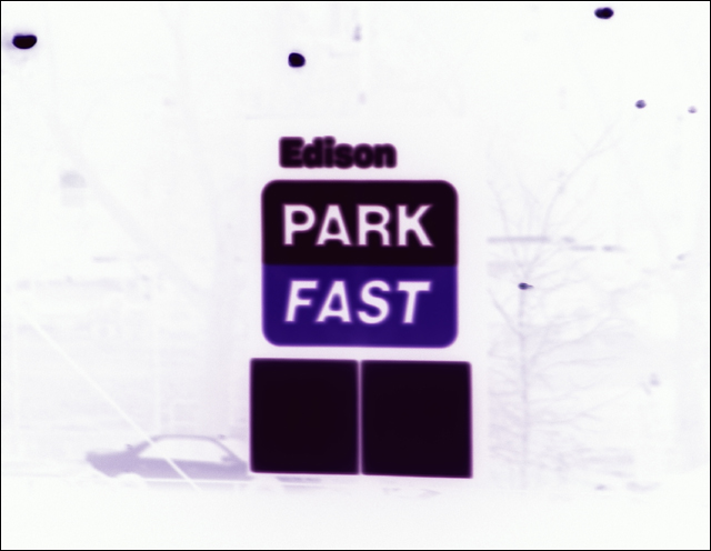
Composition - The composition is very unappealing here. the main focus is centered, and all the bright white space around it takes away from the focus.
Exposure - due to the fact that you made this negative, and you can't see any features but the sign really, I'm guessing you took this at night, and read your exposure from the bright sign? Thats just my guess though. Because of this everything around the sign was not exposed well.
Color - I like the blue of the sign, but the rest is pretty boring. Good job on deciding to leave this in color though... it would not have worked at all in black and white.l
Focus - it's hard to tell, and it may be my eyes, or it may be the sign but the letters look just a tad bit fuzzy. Maybe this was intentional?
Background - not much to say on the background for this photo, there isn't much of one, unless you really strain to find a little bit.
Fit For Challenge - I see what you were trying to do here, You were working to evoke motion more then show it. It was interesting... and it somewhat fit the challenge of motion but not of showing motion.
Wowability - it's very different and eye catching.
Final Comments - I guess this photo wasn't really what you intended it to be? for the public at least? I would love to hear what you were trying to do with this. Better luck next time! |