| Author | Thread |
Comments Made During the Challenge  |
|
|
08/07/2004 03:37:10 PM |
|
 Photographer found comment helpful. Photographer found comment helpful. |
|
|
08/07/2004 08:39:06 AM |
this probably would have looked better black & white, the middle is a bit
yucky? |
|
| Photographer found comment helpful. |
|
|
08/06/2004 01:33:20 PM |
| i like this the shadows are good |
|
| Photographer found comment helpful. |
|
|
08/04/2004 10:52:36 AM |
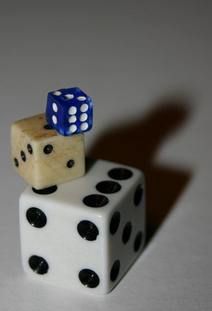
| Lighting is poor and focus seems soft. Nice idea in terms of showing scale. Because the middle dice sticks out to the left I think the pile would be better positioned towards lower right rather than lower left of the frame, with lighting correspondingly moved to throw shadows towards the left instead of the right. Alternatively reposition die so that middle one is towards right not left of white one. 6 |
|
| Photographer found comment helpful. |
|
|
08/04/2004 02:55:07 AM |
|
| Photographer found comment helpful. |
|
|
08/04/2004 12:10:28 AM |
| good idea and execution, i feel that its missing something but i dont know what that something is.... hmmm |
|
| Photographer found comment helpful. |
Home -
Challenges -
Community -
League -
Photos -
Cameras -
Lenses -
Learn -
Help -
Terms of Use -
Privacy -
Top ^
DPChallenge, and website content and design, Copyright © 2001-2025 Challenging Technologies, LLC.
All digital photo copyrights belong to the photographers and may not be used without permission.
Current Server Time: 03/12/2025 03:15:05 PM EDT.