| Author | Thread |
|
|
06/22/2011 11:01:02 PM |
i always wanted to comment on this
how extra-extraordinaire this is
now i did |
|
 Photographer found comment helpful. Photographer found comment helpful. |
|
|
06/22/2011 10:27:59 PM |
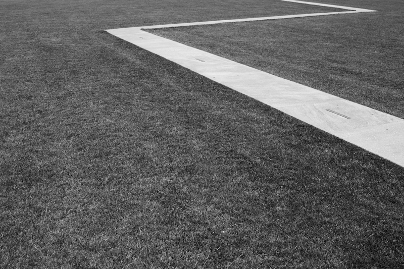
| Excellent. I really like the lines in this. I wish this were on a grander scale, but I'm still enamored with the shot. |
|
| Photographer found comment helpful. |
|
|
06/15/2011 01:15:50 PM |
| PS. This got a lovely gasp of pleasure from my friend Z. Really, that's her initial. |
|
| Photographer found comment helpful. |
|
|
06/14/2011 12:57:36 PM |
| This is very interesting -- I love the tones (or lack thereoff). Did you take take any with a slight higher camera tilt to have more of the top Z visable? |
|
| Photographer found comment helpful. |
|
|
06/13/2011 08:25:25 PM |
| How can something so simple improve with age? No time to bump up my 7. Love the first comment. |
|
| Photographer found comment helpful. |
|
|
06/13/2011 07:01:18 AM |
| Superb example of minimalism. |
|
| Photographer found comment helpful. |
|
|
06/13/2011 02:04:32 AM |
| 8 from me. Just think how much higher it would have been if you added a lot more colour, placed it in the middle, gave it more "pop", sharpen it a lot, and took out the ugly white line. hehe. |
|
| Photographer found comment helpful. |
|
|
06/13/2011 12:19:02 AM |
| I think Zorro was here. Like the composition. |
|
| Photographer found comment helpful. |
|
|
06/13/2011 12:14:46 AM |
|
| Photographer found comment helpful. |
Comments Made During the Challenge  |
|
|
06/12/2011 02:12:47 PM |
| Not bad, not bad at all ... What's lacking though? More definition? More contrast? Less contrast? Certainly a good one that left me still pondering. |
|
| Photographer found comment helpful. |
|
|
06/12/2011 06:57:28 AM |
| True minimalist, I love the simplicity of it |
|
| Photographer found comment helpful. |
|
|
06/11/2011 02:13:15 AM |
| Not sure I like this, I want to see what is up there! |
|
| Photographer found comment helpful. |
|
|
06/07/2011 04:57:50 PM |
| LOL....great shot with an interesting pattern |
|
| Photographer found comment helpful. |
|
|
06/06/2011 02:16:03 PM |
| Definite minimalism with the line. I think overall the tones of the shot are a drab medium grey and not very exciting. Nothing real dynamic to the composition other than the zig zag line and the off center placement of the subject. Perhaps a more overhead view would have added some needed perspective. |
|
| Photographer found comment helpful. |
Home -
Challenges -
Community -
League -
Photos -
Cameras -
Lenses -
Learn -
Help -
Terms of Use -
Privacy -
Top ^
DPChallenge, and website content and design, Copyright © 2001-2025 Challenging Technologies, LLC.
All digital photo copyrights belong to the photographers and may not be used without permission.
Current Server Time: 03/10/2025 06:06:41 PM EDT.