| Author | Thread |
Comments Made During the Challenge  |
|
|
08/10/2004 03:29:34 PM |
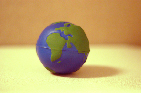
| I quite like this idea. It might have been cool if perhaps the background and base were black, with the odd speck of glitter or something to capture star like reflections. Good luck with the challenge. |
|
|
|
08/10/2004 09:01:13 AM |
|
|
|
08/09/2004 11:25:31 AM |
| I'm glad you clarified that . . ;-) |
|
|
|
08/09/2004 03:19:16 AM |
| I think this is great and I hope you do well. The title is awesome! 10 |
|
|
|
08/07/2004 02:20:09 PM |
| Makes me wanna squeeze the Earth. |
|
|
|
08/06/2004 10:58:45 AM |
| Strangely appealing for such a simple image. I like the way the background splits into two complimentary orange-yellow - I assume that's just clever use of shadow? I'd probably move the globe just a touch leftwards but not much at all. 8 |
|
|
|
08/05/2004 10:01:52 PM |
| In some ways, I really like this image. Excellent focus on the planet. Colors in background create a nice effect. I think there could have been ways to make the image better, though. For instance, having different lighting so that there is no shadow from the model. |
|
|
|
08/05/2004 08:10:49 PM |
| granted, while this is representative of a small earth, there is no context that makes it more fitting for this challenge than for the macro/close up challenge. oh well. i would probably like it more if it was so centered and if the focus was razor sharp. not wild about light yellow, but it's a personal problem. good luck, keep shooting. |
|
|
|
08/05/2004 04:09:39 PM |
| lighting could be better, and more focused |
|
|
|
08/05/2004 02:00:17 PM |
| Great title! I wish the background were more neutral color. |
|
|
|
08/05/2004 11:53:08 AM |
| I guess you couldn't compare that to the real thing but this picture does nothing for me. |
|
|
|
08/05/2004 09:13:24 AM |
|
|
|
08/05/2004 12:13:39 AM |
| Sure it meets the challenge, but the composition is very non interesting. |
|
|
|
08/04/2004 05:57:48 PM |
nice disclaimer :)
the shadow could have been stronger... and maybe the earth a bit more off center... |
|
|
|
08/04/2004 05:28:34 PM |
| not clear from picture, yes you have word it that its mini.. .. |
|
|
|
08/04/2004 02:37:53 PM |
| I like the lighting and colors, but I think it would look nicer if it were cropped differently, moving "earth" more to the bottom left-hand corner. |
|
|
|
08/04/2004 02:01:33 AM |
| Of course it´s not actual size! |
|
|
|
08/04/2004 01:01:58 AM |
|
|
|
08/04/2004 12:36:30 AM |
No frame of reference, does not meet the challenge. Compose and photograph something "miniature" in such a way that it conveys to the viewer that the subject of your photo is a tinier version of something that is normally larger.
|
|
Home -
Challenges -
Community -
League -
Photos -
Cameras -
Lenses -
Learn -
Help -
Terms of Use -
Privacy -
Top ^
DPChallenge, and website content and design, Copyright © 2001-2025 Challenging Technologies, LLC.
All digital photo copyrights belong to the photographers and may not be used without permission.
Current Server Time: 03/12/2025 01:35:32 PM EDT.