| Author | Thread |
Comments Made During the Challenge  |
|
|
08/09/2004 03:42:29 AM |
|
 Photographer found comment helpful. Photographer found comment helpful. |
|
|
08/07/2004 11:23:21 AM |
|
| Photographer found comment helpful. |
|
|
08/07/2004 07:20:57 AM |
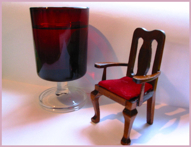
| Not very sharp. You cut the chair's leg and thr right on the left corners a little distracting. |
|
| Photographer found comment helpful. |
|
|
08/06/2004 10:18:20 PM |
|
| Photographer found comment helpful. |
|
|
08/06/2004 02:25:12 PM |
| nice shot but picture is bit blurry.... |
|
| Photographer found comment helpful. |
|
|
08/06/2004 12:16:25 PM |
| Very unsharp and sorry to say it but I find the background terible. I dont either like the frame because it highlights the background still further. |
|
| Photographer found comment helpful. |
|
|
08/05/2004 10:57:59 PM |
|
| Photographer found comment helpful. |
|
|
08/05/2004 09:31:58 PM |
| I really like the concept and the title...however I don't care for all the shadows. Good luck! |
|
| Photographer found comment helpful. |
|
|
08/05/2004 01:38:03 PM |
| Very clever and I like the lighting and shadows. |
|
| Photographer found comment helpful. |
|
|
08/04/2004 11:11:35 PM |
| Nice shot. Your chair is bigger than mine. |
|
| Photographer found comment helpful. |
|
|
08/04/2004 04:42:42 PM |
| cool shot but slightly out of focus. |
|
| Photographer found comment helpful. |
|
|
08/04/2004 03:18:22 PM |
| I especially like the lighting in this picture. Makes it kind of magical. |
|
| Photographer found comment helpful. |
|
|
08/04/2004 12:35:10 PM |
| This is a good idea. It just seems to be a bit out of focus. |
|
| Photographer found comment helpful. |
|
|
08/04/2004 11:25:04 AM |
| If the chair was in focus, the image would have more impact imo |
|
| Photographer found comment helpful. |
|
|
08/04/2004 11:24:46 AM |
| I like the title and idea but the picture seems blurry. |
|
| Photographer found comment helpful. |
|
|
08/04/2004 10:21:24 AM |
| Good iodea, but the picture suffers from unsharp focus. |
|
| Photographer found comment helpful. |
|
|
08/04/2004 10:08:59 AM |
| oh...so close! If everything had been in focus and the lighting was a little more formal, this could have been the winner! |
|
| Photographer found comment helpful. |
|
|
08/04/2004 01:53:11 AM |
| This photo has a lot of potential. I really like the concept behind it. What detracts from the concept, however, is the poor lighting and focus. I think if you try some more angles and play with the lighting and focus, you could have a ribbon winner, here. |
|
| Photographer found comment helpful. |
Home -
Challenges -
Community -
League -
Photos -
Cameras -
Lenses -
Learn -
Help -
Terms of Use -
Privacy -
Top ^
DPChallenge, and website content and design, Copyright © 2001-2025 Challenging Technologies, LLC.
All digital photo copyrights belong to the photographers and may not be used without permission.
Current Server Time: 03/13/2025 03:51:44 AM EDT.