| Author | Thread |
Comments Made During the Challenge  |
|
|
08/09/2004 04:39:43 PM |
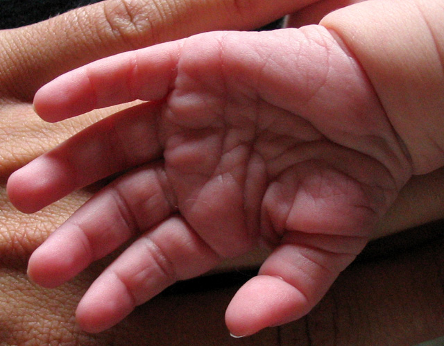
Nice lighting here, I like the grainy effect, I think this would have scored an extrat point from me if it had been in B&W.
While I can definately see that it's a smaller hand, I think it might have been better if you had moved back a bit with your camera. The wee ones hand looks quite big, I do know it's against the adults one, but the perspective looks a little wrong. 8 |
|
 Photographer found comment helpful. Photographer found comment helpful. |
|
|
08/07/2004 02:20:33 PM |
|
| Photographer found comment helpful. |
|
|
08/06/2004 08:29:37 PM |
|
| Photographer found comment helpful. |
|
|
08/06/2004 01:23:24 PM |
This one seems very miniature. But less croping or wider frame would have given a better comparison. Also I think it would have been better to turn the palm down to show more of the smooth skin at the back of the hand of a newborn. For this subject sharpness is not the most vital thing (for my opinion) so I think litle gaussian blurr would have make this one better expecally since it seems litle noise.
But the idea is fine and the image is ok. |
|
| Photographer found comment helpful. |
|
|
08/05/2004 12:47:14 PM |
| Original Idea. Might work better if you had the same side of the hands showing, either tops or bottoms. |
|
| Photographer found comment helpful. |
|
|
08/05/2004 12:32:23 PM |
| Just because it is the way I normally present hand shots, I would really like to see this image in black and white. The lines and details just really seem to jump out at you when in black and white. I like the composition and the light, but I would like to see the little hand more in focus and the large hand a little softer. Just my opinion though. Good work. |
|
| Photographer found comment helpful. |
|
|
08/04/2004 04:35:10 PM |
| a bit too grainy but beautiful photo! title could have been better imo... 8 |
|
| Photographer found comment helpful. |
|
|
08/04/2004 11:05:01 AM |
| Very nois, especially in the child's palm.You need to remove the noise. |
|
| Photographer found comment helpful. |
|
|
08/04/2004 11:04:37 AM |
| might be just me ,but the color of the baby's hand looks a little strange... maybe from compression? Also, the baby's palm is a little dark. Otherwise, nice focus and a good idea... 6 |
|
| Photographer found comment helpful. |
Home -
Challenges -
Community -
League -
Photos -
Cameras -
Lenses -
Learn -
Help -
Terms of Use -
Privacy -
Top ^
DPChallenge, and website content and design, Copyright © 2001-2025 Challenging Technologies, LLC.
All digital photo copyrights belong to the photographers and may not be used without permission.
Current Server Time: 03/12/2025 06:37:02 PM EDT.