| Author | Thread |
Comments Made During the Challenge  |
|
|
06/28/2011 11:25:11 PM |
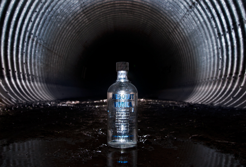
| I really like this idea. The cold steel lines are not only beautiful, and a great choice as far as coloring that compliment the Absolut bottle. But something in the lighting/ prop placement seems awry. The bottle is almost completely illegible and (this is my own PP in this challenge) the safety wrapper is still intact. The viewer is teased with the lines being reflected in the water- would have loved to see those possibilities.. |
|
 Photographer found comment helpful. Photographer found comment helpful. |
|
|
06/28/2011 09:01:54 PM |
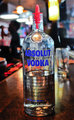
I love the composition and the lighting... but I doubt that Absolut® would use an ad without their name/logo being entirely visible.
I may or may not be voting, so please do not equate my comment with any score. |
|
| Photographer found comment helpful. |
|
|
06/27/2011 08:00:55 PM |
| Not sure if a dirty culvert is going to get me thirsty - good thinking outside the box but not marketable |
|
| Photographer found comment helpful. |
|
|
06/26/2011 02:16:12 PM |
| Idea is great, I just wish the bottle didn't wash out so much due to the lighting. I can barely even tell it says "ABSOLUT VODKA". |
|
| Photographer found comment helpful. |
|
|
06/23/2011 09:59:30 PM |
| I really like the composition of this. The curved lines of the tunnel frame the bottle perfectly. The industrial effect is perfect for vodka. The mud around the vodka is disgusting though. Perhaps some sort of board and a shallower depth of field would have been a little better, but the setting obviously was working for you and against at the same time. :\ The lighting on the bottle isn't bad. It's nicely illuminated, but it's a bit hard to read the logo. I think the majority of people aren't looking at this though. The halo effect of the tunnel and the framing of the bottle are hard to ignore, and frankly, my eyes are always drawn back to it. It almost has a mesmerizing effect. |
|
| Photographer found comment helpful. |
|
|
06/23/2011 09:57:29 PM |
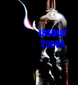
| it appears the lighting on the bottle blew out and it has recieved a fair bit of attention in pp. i think it detracts greatly from the picture. |
|
| Photographer found comment helpful. |
|
|
06/22/2011 12:10:41 PM |
| The light aimed to the front of the bottle doesn't let the letters to be read. |
|
| Photographer found comment helpful. |
Home -
Challenges -
Community -
League -
Photos -
Cameras -
Lenses -
Learn -
Help -
Terms of Use -
Privacy -
Top ^
DPChallenge, and website content and design, Copyright © 2001-2025 Challenging Technologies, LLC.
All digital photo copyrights belong to the photographers and may not be used without permission.
Current Server Time: 03/10/2025 08:58:36 PM EDT.