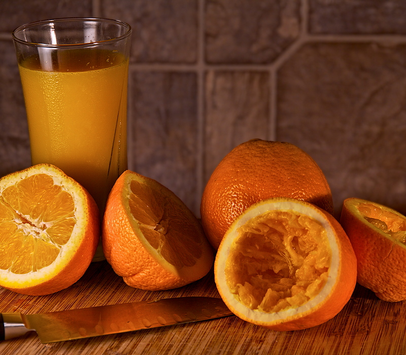
This was a cool challenge idea, I really enjoyed looking over my old photos to see what could be improved upon. I narrowed my choices down from nearly 140 to about 6 based on location, time of year, etc. From those 6, the "Freshly Squeezed" entry in the "Black and White Still Life" challenge really stuck out. I really liked my entry, but the voters didn't (end score was 5.05). Luckily, a number of people left comments that I could use to improve upon. They came down to these themes:
* Black and white didn't work for the setting
* The background was someone distracting (especially with the big shadow)
* Inclusion of a squeezed orange would be helpful
* Needed softer lighting
So I took these suggestions to heart and re-shot keeping all of them in mind. I kept the color in this one (I did convert to B&W but wasn't happy). I switched out the towels in the background for a piece of linoleum flooring. I included a squeezed orange (actually, this is my least favorite part of the image). And I used much softer lighting.
Specifically on the lighting, I was going for early morning, through the window, light. Using the skills I learned at the Flash Bus Tour, I built up my light until it was right. First I set the shutter to blank out all of the ambient light. Then I setup a orange gelled flash on the left with a mini soft-box pointing past the scene (this is the sunshine). I propped up a reflector dish with the gold side to add some shadow relief. I then used a second flash to point directly at the reflector which added more fill for the shadows. Then I turned on two desk lamps on the floor under the table, and put some red/yellow tissue paper on them to color match as best I could. These desk lamps provide that hint of light you see on the background to help cause separation.
Also worth noting is that I used a comment from a completely different challenge and applied it to this one. I put a polarizing filter on my lens to reduce and control the reflections in the scene. This really helped on the glass as I was able to give it a kitchen window style reflection.
Through this lighting technique, I was able to replicate early morning sunshine in a kitchen as best I could. The textures and colors are all nicely visible.
Post Processing:
* Crop
* Increase recovery slightly
* Increase black point
* Increase contrast
* Increase saturation
* Highlights and Shadows (with increasing mid-contrast)
* Light helpings of Topaz Adjust and Detail
* White balance
* Increase contrast
* Increase definition
* Curves to brighten mostly lows and mids
* Levels
* Definition and contrast added to all of the foreground
* Burn the leftmost orange face so it's not overly bright
* Blur the background a bit to get back to pre-topaz state
* Partially desaturated the white ring on the squeezed orange. The combination of getting orange juice on that and the gelled light made that a bit too orange (lacking character)
* Export as TIFF
* Resize
* Sharpen Edges
* Save as JPEG
Statistics
Place: 50 out of 74 Avg (all users): 5.6260 Avg (commenters): 7.1667 Avg (participants): 5.6579 Avg (non-participants): 5.6118 Views since voting: 789 Views during voting: 235 Votes: 123 Comments: 6 Favorites: 0
A lot of work but a lot of taste too! Nicely done - I might have lit the glass a bit more to bring out the condensation (or added some moisture beads) but the colors are lovely and it's crisply in focus.
Great improvement and the squeezed oranges is a nice touch. It also looks much better in colour but that may not have gone down too well in the original challenge :-)
Lets start off with the... 'cons' I see in this image (take everything I say with a grain of salt--I'm far from qualified in photography, and even less in still life style shots!).
This image captured my eye when I voted in the challenge. What grabbed my attention first was the glass. And the dark line that's going down the side of it. Unfortunatly to my eyes it didn't help the image. It made me think that the photographer was... maybe clumsy in setting up his shot with a crack showing in it.
The next thing I thought about was the oranges. They're find oranges that I wouldn't hesitate to eat, but they don't have the... zest (heh heh heh) that a fruit still life needs to score well. I'm awful at these things so I'm nobody to recommend anything. But, the textures on the orange on the right isn't very pleasant to me...
Pros:
The lighting is great. Nothing's too bright. Nothing's too dark. It shows the droplets on the side of the glass to great effect. And it enhances the textures ov everything wonderfully (glass, oranges, knife, board).
Sharpness is excellent over all the items photographed. And the wall behind is out of focus enough to not distract. Perhaps it could do with being more so, but it's fine for me.
Comparison to take one:
The colour brings a lot to this image. The whole scene feels warmer than the black and white version. This fits in with my imagination of oranges growing in tropical bliss. In the black and white version the light was a little harsher in some places. I think you overcame that well here.
Something that I'd've done differently:
I think that some sort of continuous colour grounding and background would have suited this image well. Like what h2 does in his sometimes, if you know what I mean.
I was thinking for a while between 5 and 6 for this. If there was a 5.5 button I'd've given it that, so I figured that rounding it up to a 6 was fair.