| Author | Thread |
|
|
07/01/2011 01:57:27 AM |
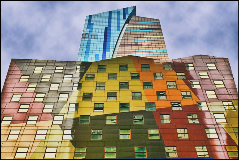
| Now that is a funky building. |
|
 Photographer found comment helpful. Photographer found comment helpful. |
|
|
07/01/2011 12:16:29 AM |
| Nice remake of the original. That's great no 1,2 r 3's. |
|
| Photographer found comment helpful. |
Comments Made During the Challenge  |
|
|
06/30/2011 10:14:34 PM |
| Ah, NY at its worst, but beautifully captured. |
|
| Photographer found comment helpful. |
|
|
06/30/2011 08:41:15 AM |
| The future is colorful and full of optimism. |
|
| Photographer found comment helpful. |
|
|
06/28/2011 08:26:04 PM |
Fabulous! I love the colors and contrast!
I may or may not be voting, so please do not equate my comment with any score. |
|
| Photographer found comment helpful. |
|
|
06/28/2011 11:34:06 AM |
| Love this shot, superbly colorful. |
|
| Photographer found comment helpful. |
|
|
06/26/2011 09:19:59 PM |
| I almost looks like a painting on the wall, not a real building. I would have used more saturation and contrast to give more life this otherwise colorful image, and avoid the border... |
|
| Photographer found comment helpful. |
|
|
06/26/2011 08:09:50 PM |
| Back to comment... What a cool building! I probably said that the first time around. LOL! |
|
| Photographer found comment helpful. |
|
|
06/26/2011 05:24:43 PM |
| That's a supremely cool building. Those exact lines and angles of the structure really contradict the painting style, which is what makes this so interesting to me. |
|
| Photographer found comment helpful. |
Home -
Challenges -
Community -
League -
Photos -
Cameras -
Lenses -
Learn -
Help -
Terms of Use -
Privacy -
Top ^
DPChallenge, and website content and design, Copyright © 2001-2025 Challenging Technologies, LLC.
All digital photo copyrights belong to the photographers and may not be used without permission.
Current Server Time: 03/12/2025 03:24:49 AM EDT.