| Author | Thread |
|
|
01/11/2003 07:24:13 PM |
| You should send this to apple |
|
Comments Made During the Challenge  |
|
|
12/22/2002 11:05:39 PM |
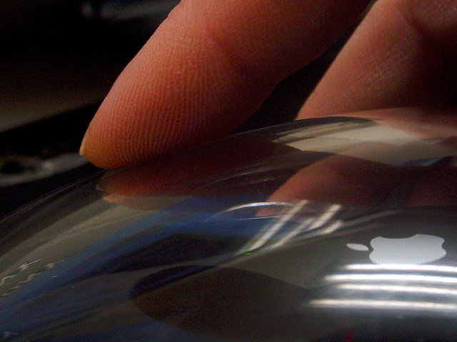
Witty title. I like the super close up on this. I justed checked how it would look in black&white and I think it's much better. Mostly because the reddish colour if the fingers disappears. The light streaks near the apple logo are a bit distratcting (from the logo). The grain is ok. I think it looks good on this photo.
Stephan
|
|
|
|
12/16/2002 10:47:59 PM |
| TOOOO dark. I can't see what is in your hand. Sorry but it's a 2. PTL |
|
|
|
12/16/2002 05:02:38 PM |
| With a little reflection control, this would be excellent. Love the tight composition and sharpness, but the flourescents &c. detract. |
|
|
|
12/16/2002 12:34:23 AM |
| Ha ha.. too bad apple is overpriced and has a silly OS. Nice pic though. |
|
Home -
Challenges -
Community -
League -
Photos -
Cameras -
Lenses -
Learn -
Help -
Terms of Use -
Privacy -
Top ^
DPChallenge, and website content and design, Copyright © 2001-2025 Challenging Technologies, LLC.
All digital photo copyrights belong to the photographers and may not be used without permission.
Current Server Time: 03/12/2025 03:28:07 PM EDT.